A brand built for athletes chasing the peak.
Apex Training is for people who measure themselves against the best. The identity had to read as power and focus — and land before anyone reads a word.
It all starts from one idea: at the peak. The name works as a question — where are you AT — and a challenge: what will you do to get there?
You meet the feeling before the logo. A horse mid-stride, charged with heat, stands for the effort behind every personal best. Red for intensity, black for focus — the two colours the system runs on.
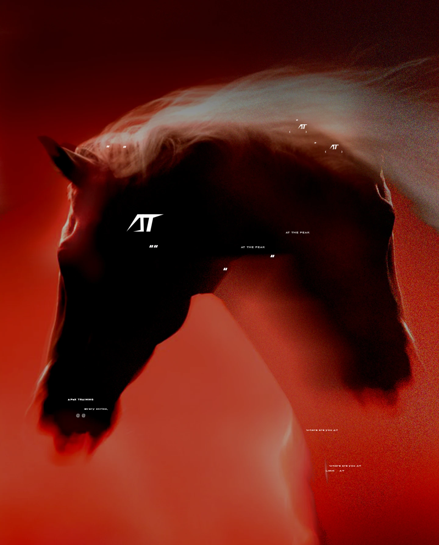
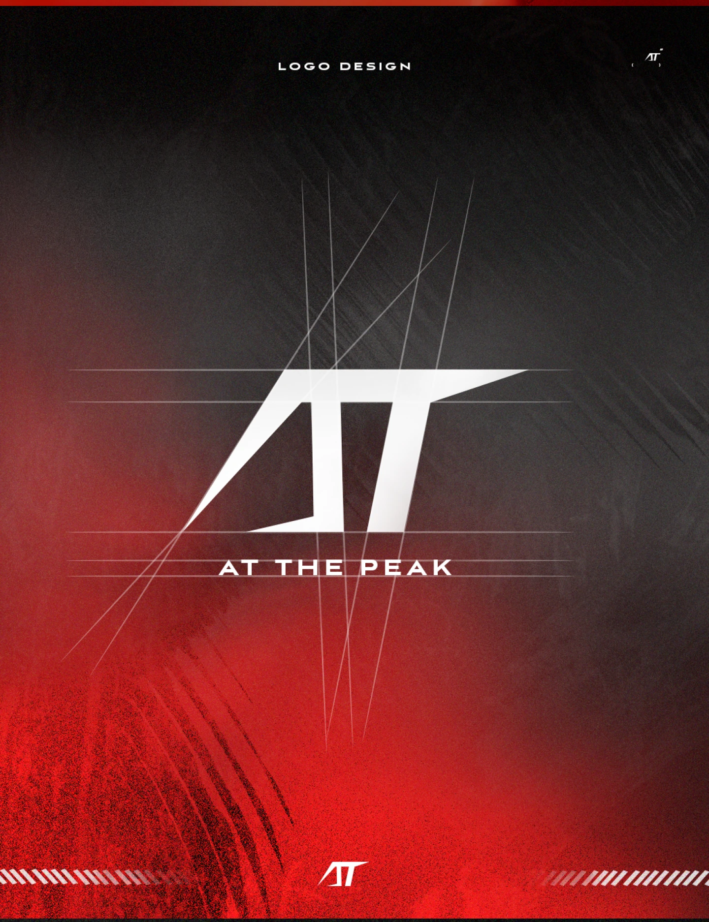
The AT monogram is built like equipment, not decoration. The strokes are sharp and angular, cut so the two letters lock into a single mark that holds together at any size.
Underneath sits the line AT THE PEAK — the promise spelled out, so the mark and the words say the same thing.

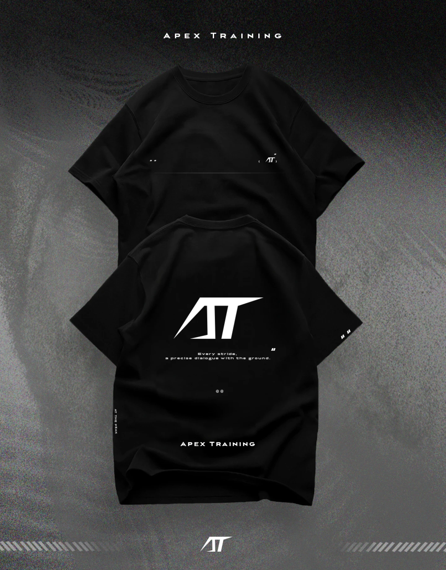
A training brand lives on what people wear. On apparel the mark goes quiet — a small AT on a black tee — so it works as kit, not merch.
The brand earns its place by restraint, not by shouting. Worn, it should read as belonging, not branding.

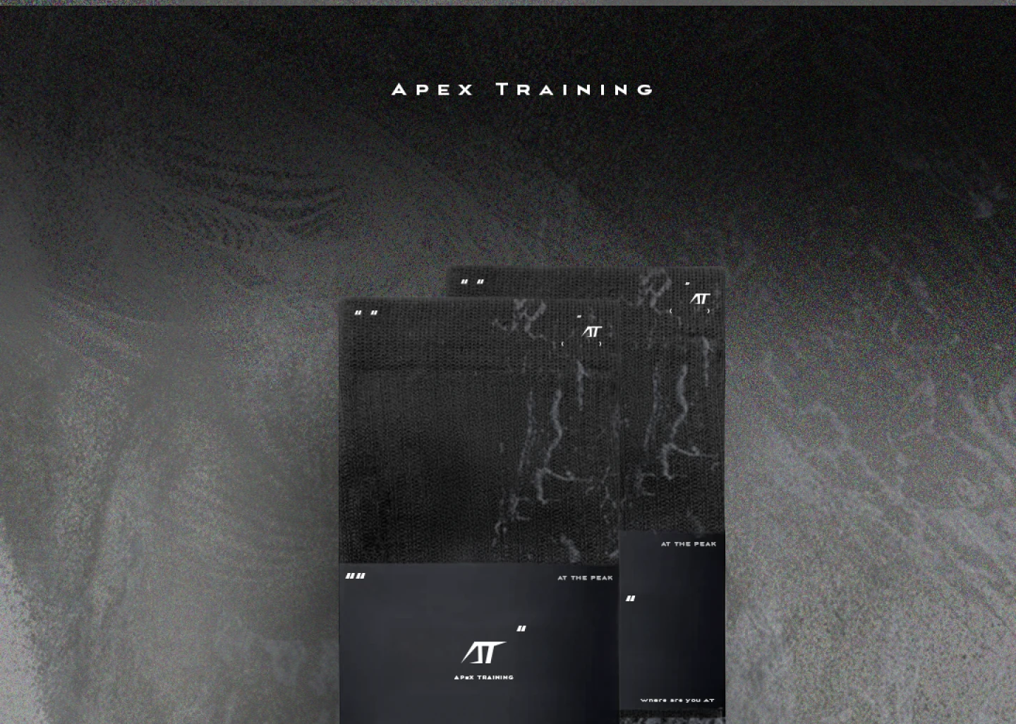
The system carries down to the smaller pieces — tags, socks, the details you only notice up close. Same palette, same monogram, so every touchpoint reads as one brand.

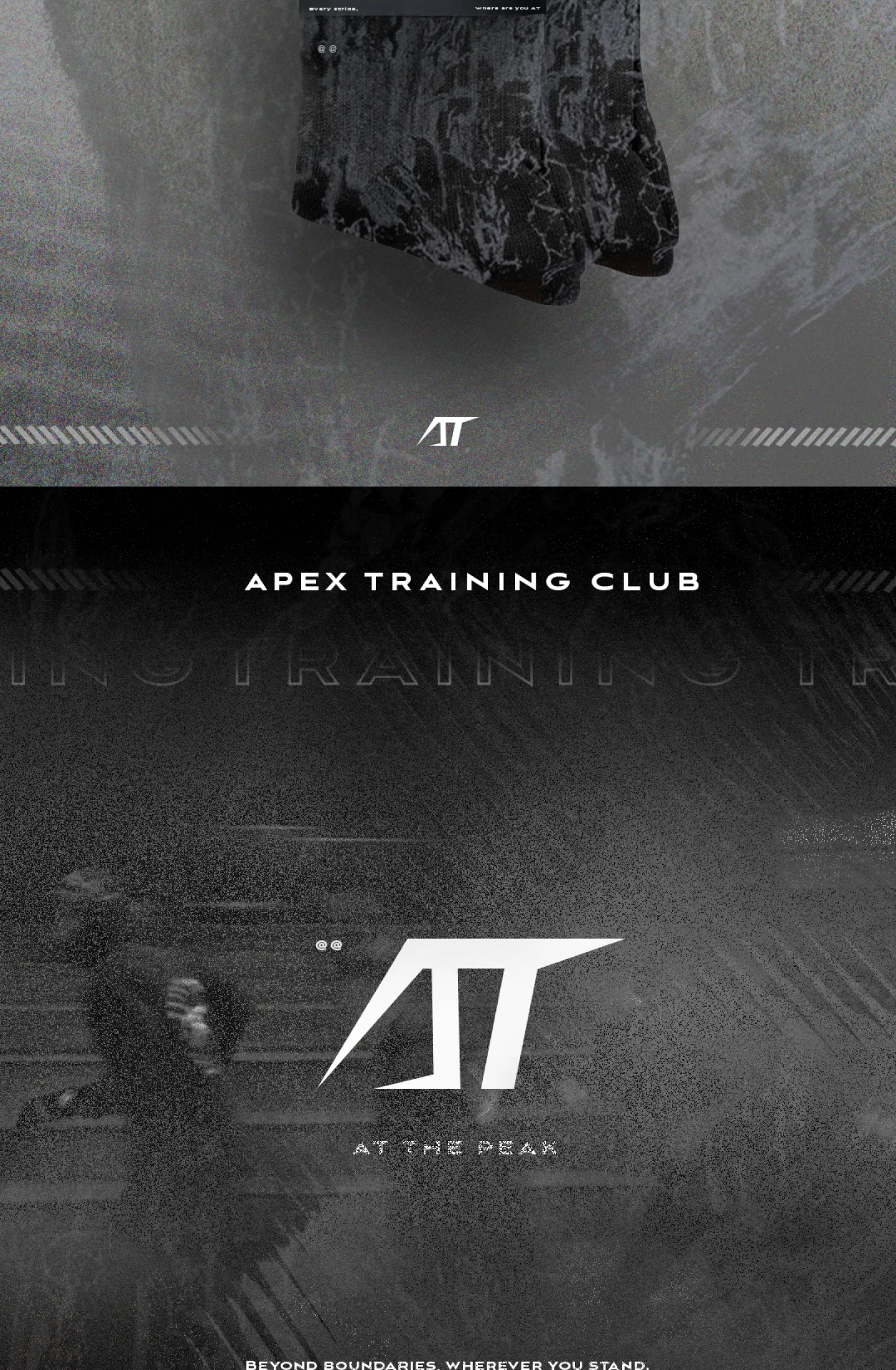
Apex Training is a club as much as a label. APEX TRAINING CLUB turns the brand outward — from a mark you wear to a group you belong to.
The line beyond boundaries, wherever you stand carries the idea past the gym and onto the road.

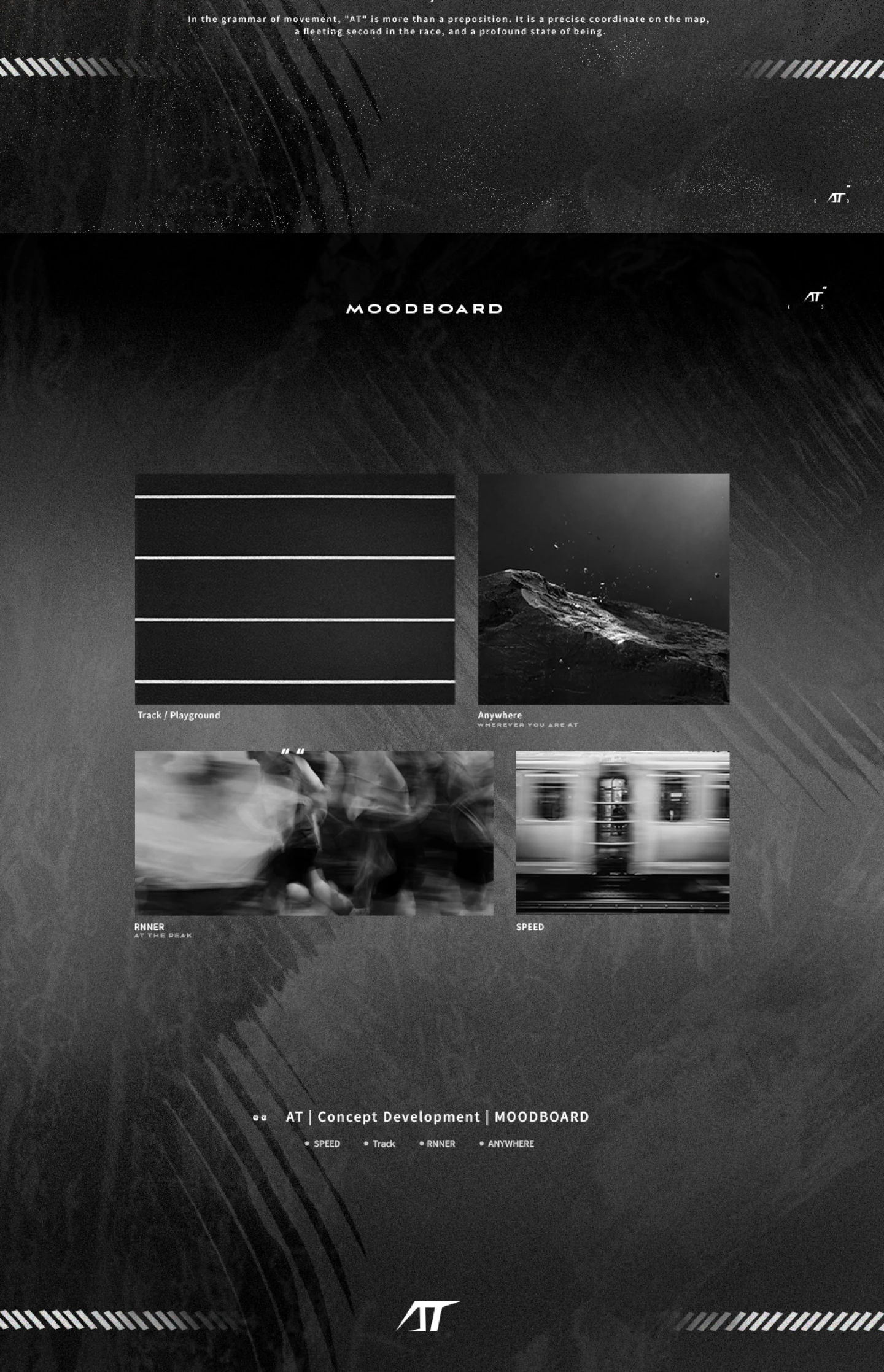
The direction was set before any mark was drawn. The moodboard pins down the world the brand lives in — texture, motion, low light, hard contrast — so every later decision had something to measure against.

For a brand identity, the work is judged before a single word is read. The goals I set it against:
Trade-off & reflection: the hardest part was restraint. An identity that hits on sight usually shouts; the discipline here was the opposite — make a single mark carry the intensity, so it scales from a sock to a billboard without losing it. The lesson: an identity's power often comes from what you take away.
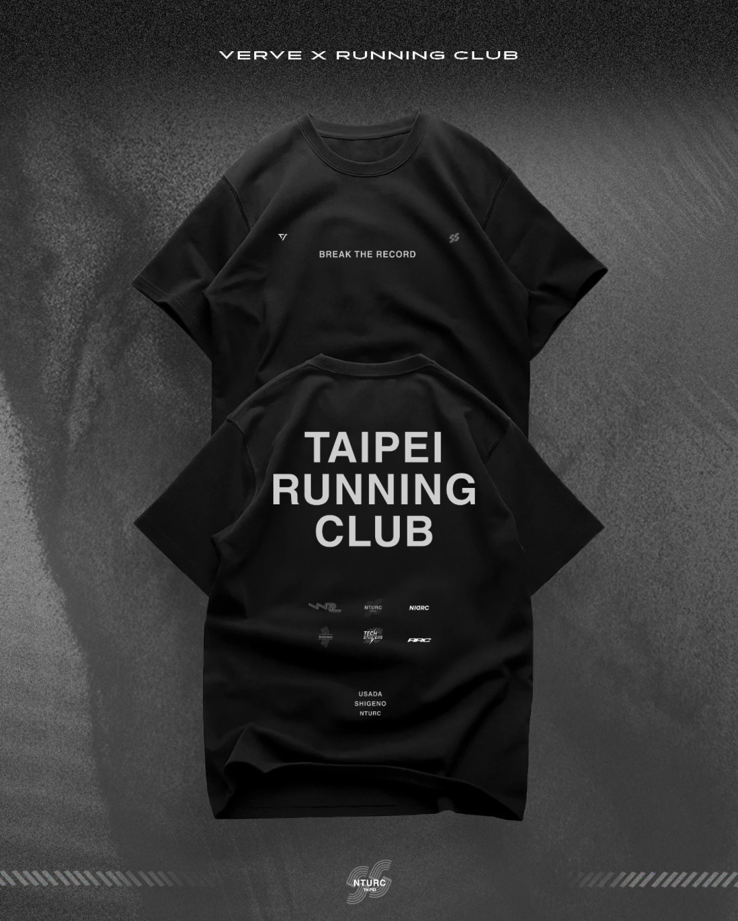
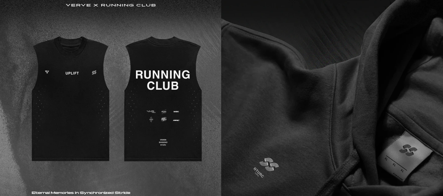
The same identity discipline, a different sport. Taipei Running Club needed a mark and a kit a crew actually wants to wear — built around "Break the record", minimal black layouts and club badges. The test was never how it looked, but whether a runner would reach for it, week after week.


Want the complete design boards, in full resolution?
See the full case on Behance ↗︎