← Back to work
AIEDO · WEBSITE & APP

aiedo

One calm home for a beauty brand living across two worlds.

(ROLE)

UI/UX, Branding
& Motion

(SCOPE)

Website &
mobile app

(LANGUAGE)

Calm · translucent · product-first

(DELIVERABLES)

UI kit · Wireframes ·
Brand guide · Motion

aiedo sells across two very different product lines — Skin care and Home living — and needed a single, considered home that feels premium without feeling cold. The work runs from positioning all the way to a Safari-ready website and app.

01Where it started

aiedo is a beauty and home brand selling across two very different lines — Skin care and Home living. This was a redesign: the original site had grown without a system.

The problems were concrete. Products were filed into one messy stream, so the two lines blurred together. The hierarchy was flat — nothing told you what to read first — and with no motion the page felt static and the positioning unclear.

So I framed the redesign as testable hypotheses, not just a look. Give each line its own entry point and colour logic, and people should stop confusing skincare with home. Let hierarchy and motion lead the eye, and the homepage should read premium instead of static. The metrics that would prove them — fewer wrong-line product views, deeper homepage scroll — need live traffic I didn't have yet, so I hold them as hypotheses the design was built to test, not outcomes I'm claiming.
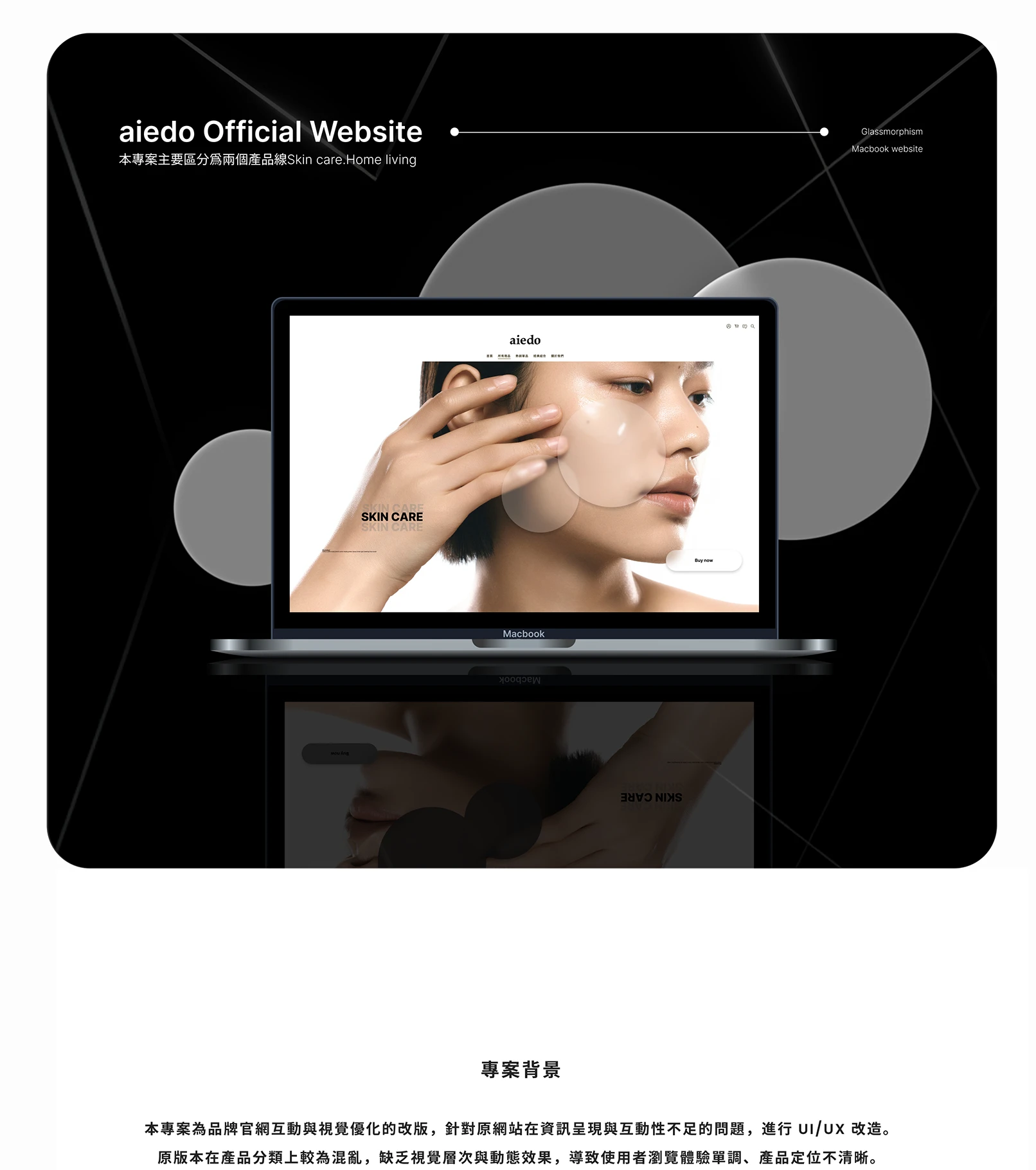
aiedo official website — redesign hero
aiedo official site — redesignContext
02Reading the competition

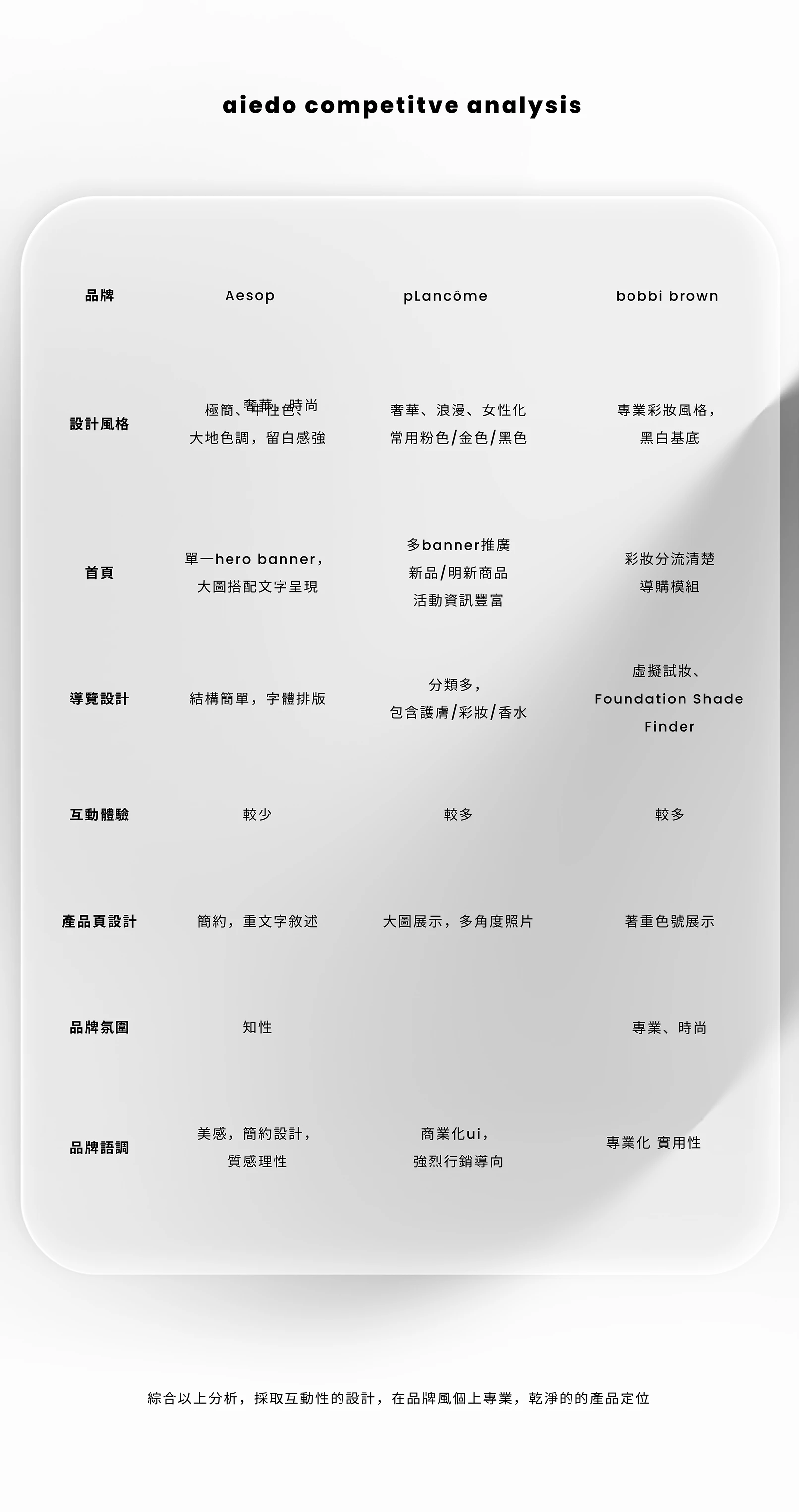
Before drawing anything I mapped aiedo against three references — Aesop, Lancôme and Bobbi Brown — across homepage, navigation, interaction, product pages and tone.

Aesop is minimal and editorial but low on interaction; Lancôme is rich but heavily commercial; Bobbi Brown is functional and shade-led. The gap I aimed for: interactive and clean, premium without the hard sell.

That one decision — interactive but restrained — set the rules for everything after it.

aiedo competitive analysis — Aesop, Lancôme, Bobbi Brown
Competitive analysis — Aesop · Lancôme · Bobbi BrownResearch
03One brand, two lines

The core decision was to stop filing everything in one stream and split the catalogue by how people actually shop: Skin care for the daily routine, Home living for atmosphere.

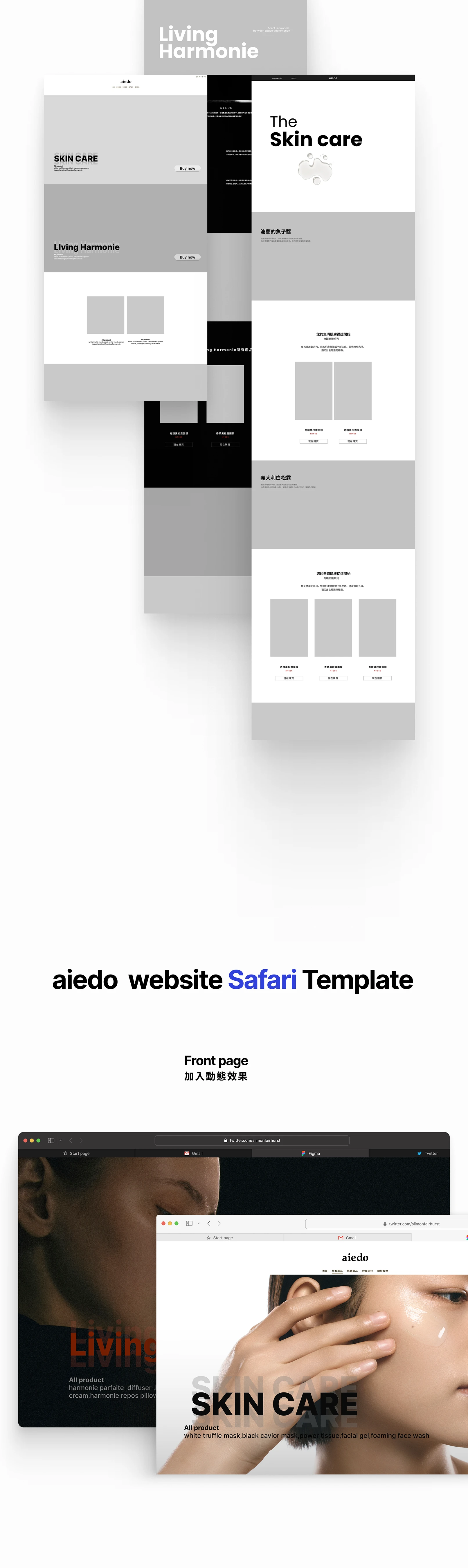
I wireframed each line its own front page and rhythm — hero, product sections, then cards with a clear path to buy — so a visitor lands in the world they came for, not a mixed shelf.

aiedo wireframes — Skin care and Home living, Safari-ready template
Wireframes — Skin care & Home livingInformation architecture
04The system

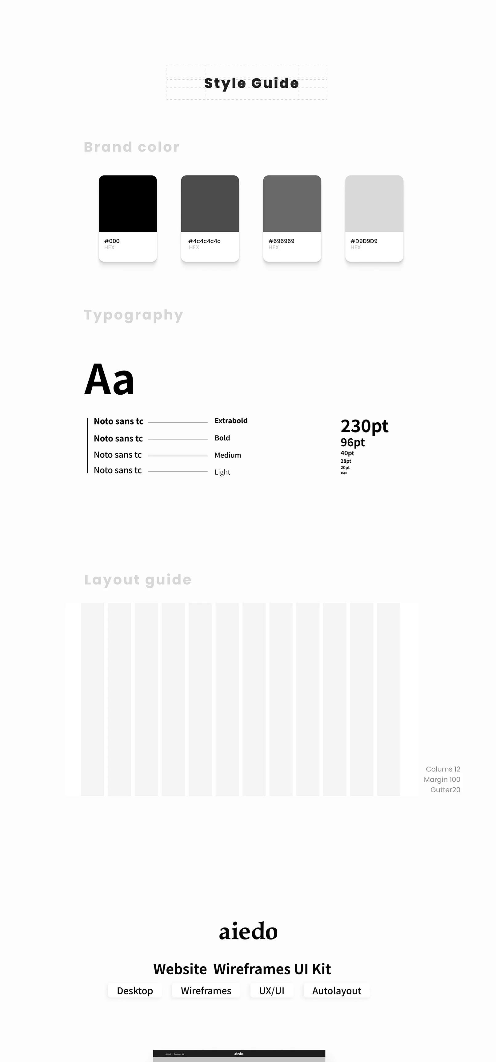
To keep two lines in one family I built a tight system. A neutral palette — black through to light grey — lets the products carry the colour. Type is Noto Sans TC across four weights for clear hierarchy, on a 12-column grid (100 margin, 20 gutter).

On top sits a translucent, layered surface: soft depth and transparency that reads like skincare, not software.

#000000
#4C4C4C
#696969
#D9D9D9
aiedo style guide — colour, type and grid
Style guide — colour, type, gridDesign system
05Before / after

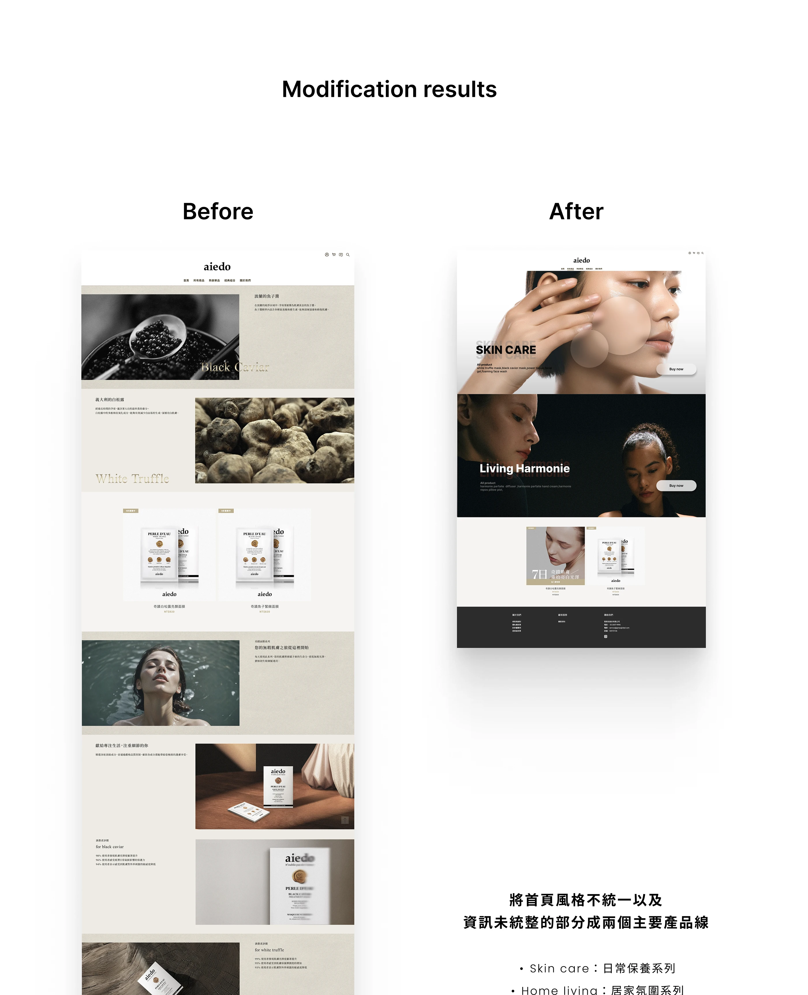
The redesign earns its keep on the homepage. The old page was a long, even-weight scroll where the two lines and the products all competed for the same attention.

The new one leads with a split hero for Skin care and Home living, raises the visual hierarchy so the eye has somewhere to land first, and uses a carousel to hold attention instead of an endless scroll.

aiedo homepage — before and after
Homepage — before & afterResult
06Down to the components

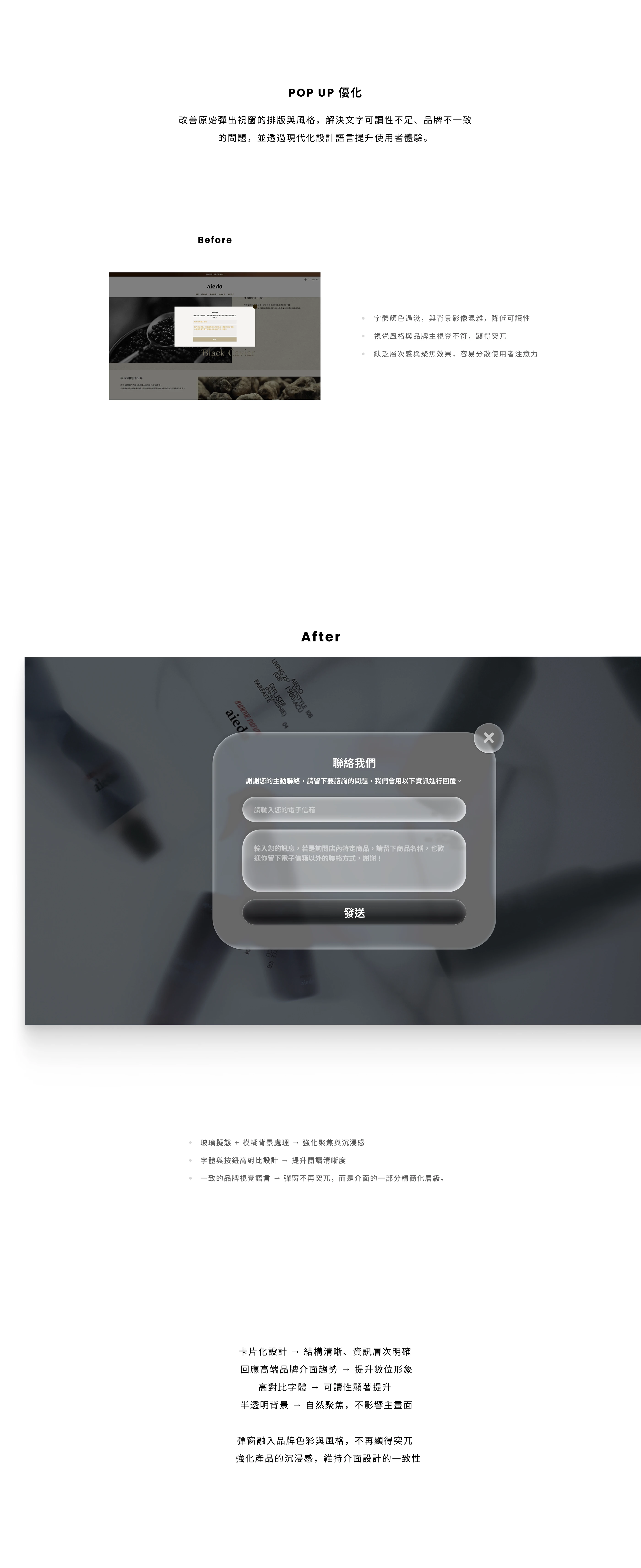
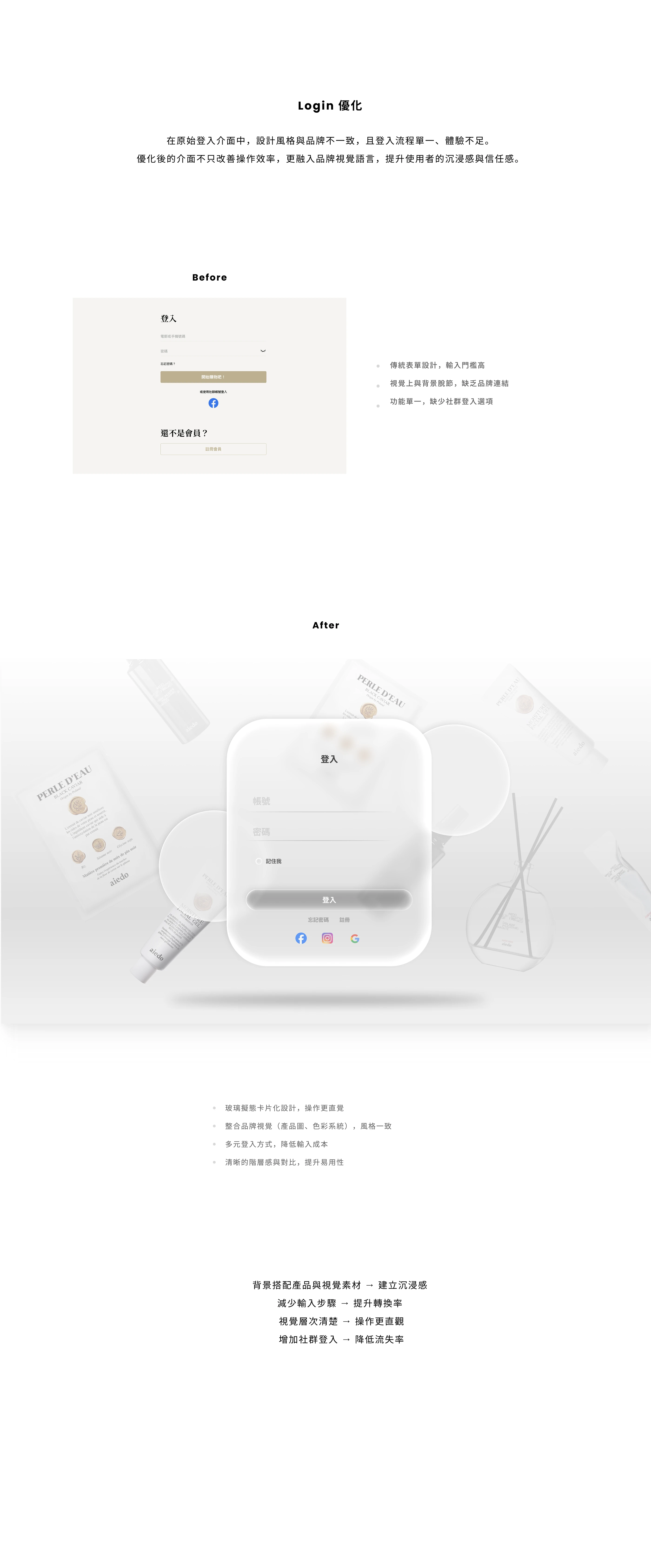
The same thinking goes to component level. The contact popup and the login were redrawn in glass — centred, translucent, with blurred depth — so a moment that's usually friction feels considered.

The glass isn't decoration: it adds warmth and depth without putting anything between the user and the next tap.

aiedo contact popup — before and after, glassmorphism
aiedo login — before and after, glassmorphism
Contact popup & login — before / afterComponent craft
07Two worlds, one brand

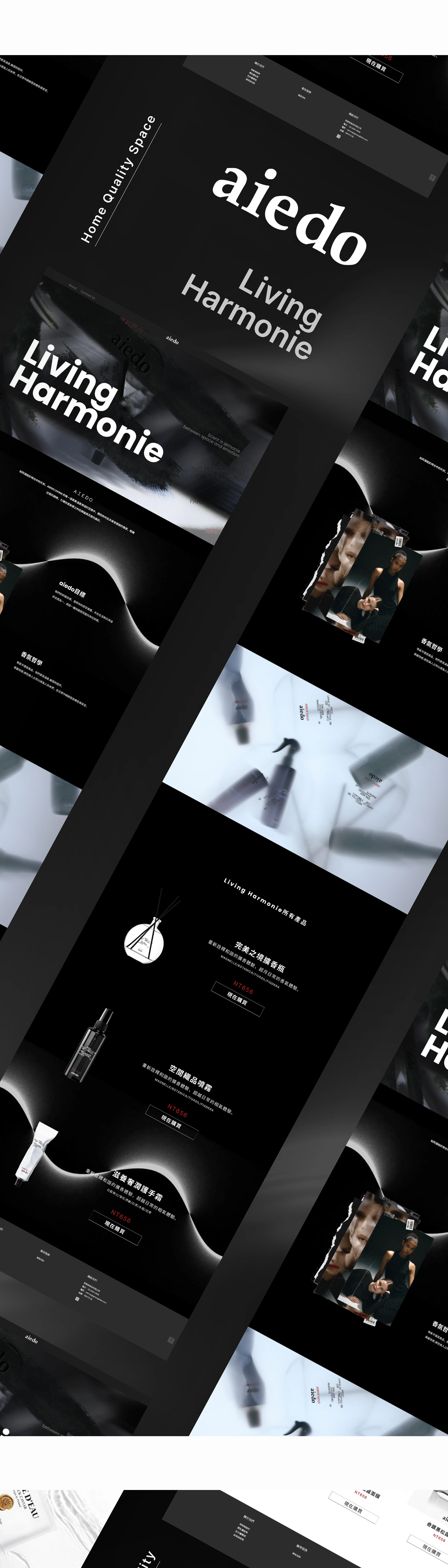
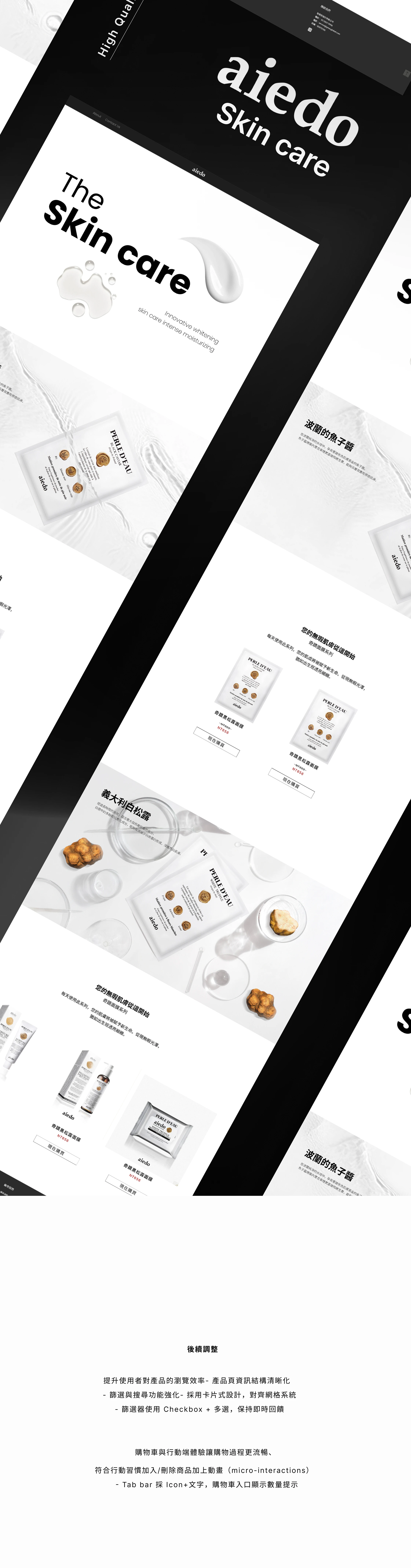
The two lines get opposite atmospheres on purpose. Home living goes dark and quiet — Living Harmonie, a space you sink into. Skin care goes light and clean — clinical calm, products on white.

Same logo, same grid, same type. Only the mood changes, so each line feels like its own world while still, unmistakably, being aiedo.

aiedo Home living — Living Harmonie, dark line
aiedo Skin care — light, clinical line
Home living (dark) vs Skin care (light) — final UIArt direction
08Motion & micro-interactions

Motion carries what the static comps can't show. Buttons and product cards lift on hover, text fades up as you scroll, and image and content arrive together to give the page rhythm.

Down at the detail: checkboxes and multi-select filters, an icon-plus-label tab bar, a cart that shows its count. Motion clarifies — it never decorates.

09Design goals & reflection

Live results weren't mine to claim here, so I set the bar as design goals — what the work had to achieve to be worth shipping:

  • One brand, two lines — Skin care and Home living read as one family, never two sites bolted together.
  • Premium without cold — the glass UI adds warmth and depth without slowing the path to product or checkout.
  • Calm by default — the interface recedes so the products carry the page; motion clarifies, it never decorates.

Reflection: the hard part wasn't making it look good — it was letting two opposite worlds share one system and still each stand on their own. The lesson: consistency isn't making every page look the same; it's making every page unmistakably belong to the same brand.

(Live performance metrics to be added once the brand ships and tracks them — no invented numbers.)

Want the complete design boards, in full resolution?

See the full case on Behance ↗︎
NEXT PROJECT
KPLUS →
All work
© 2026 Alex Hsuaiedo — Website & AppTaipei, Taiwan