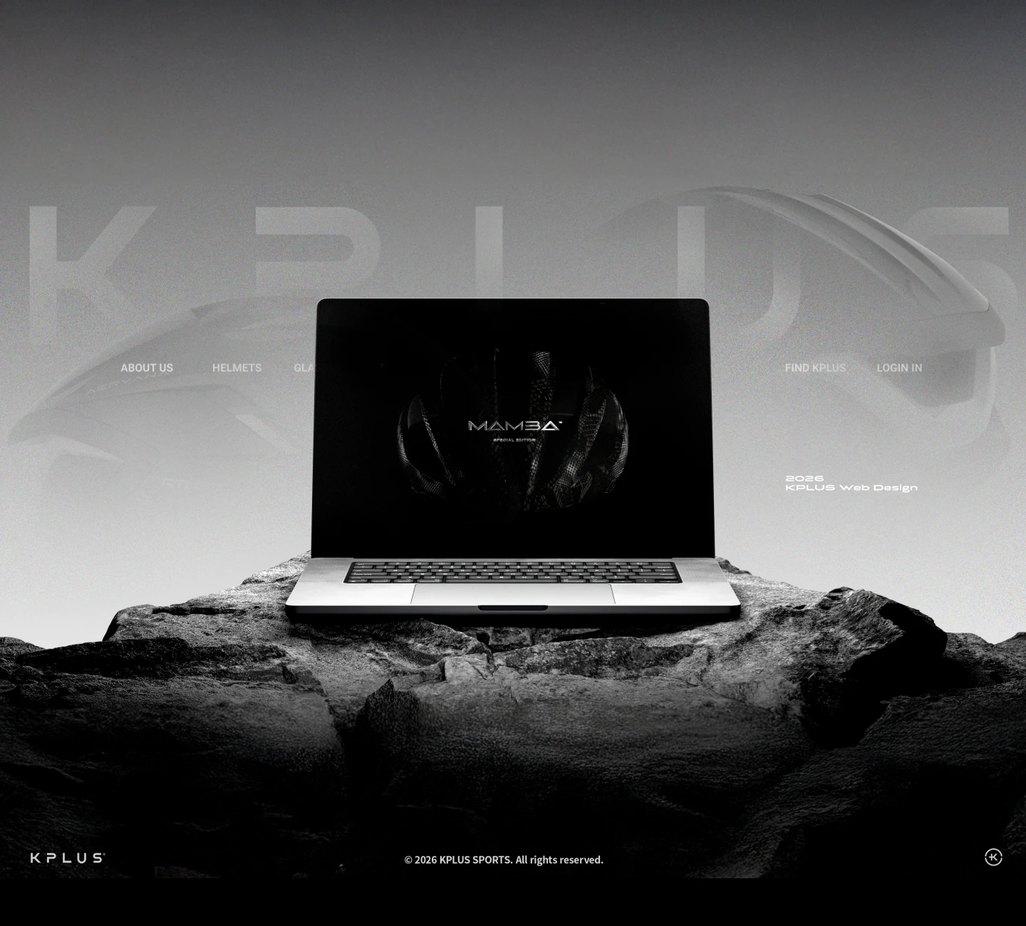
Cinematic key visual — the MAMBA special editionKPLUS · 2026
The old site had every feature — and no feeling. I rebuilt it from diagnosis, not decoration, into a cinematic stage that finally matches the product.
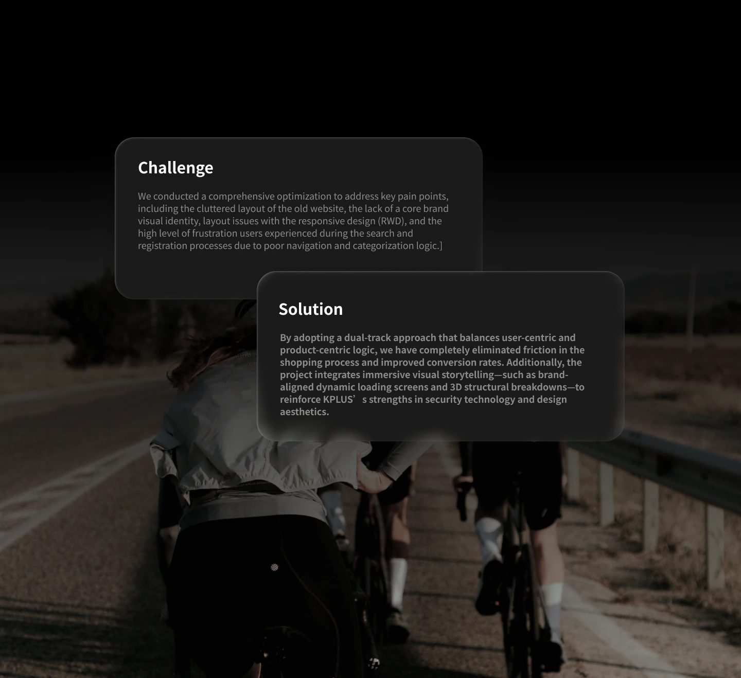
Before touching a pixel, the work started with a diagnosis. The old KPLUS site felt flat to interact with, its entry points weren't intuitive, and — for a brand with international ambition — it simply didn't carry enough weight. Defining those problems first is what justified a full redesign.
This began as a UX problem, not a visual one. The issues were identified through internal stakeholder feedback and a heuristic, page-by-page audit of the live site — not assumption. Three were significant enough to justify a full redesign:
The audit recorded concrete usability failures: menu items that did not resolve to their pages, a non-functional after-sales control, no confirmation state after registration (no feedback on system status), and layouts that broke on mobile — friction that raises task effort and drop-off.
Naming these turned "make it nicer" into a redesign with a purpose — and gave every later decision something to measure against.
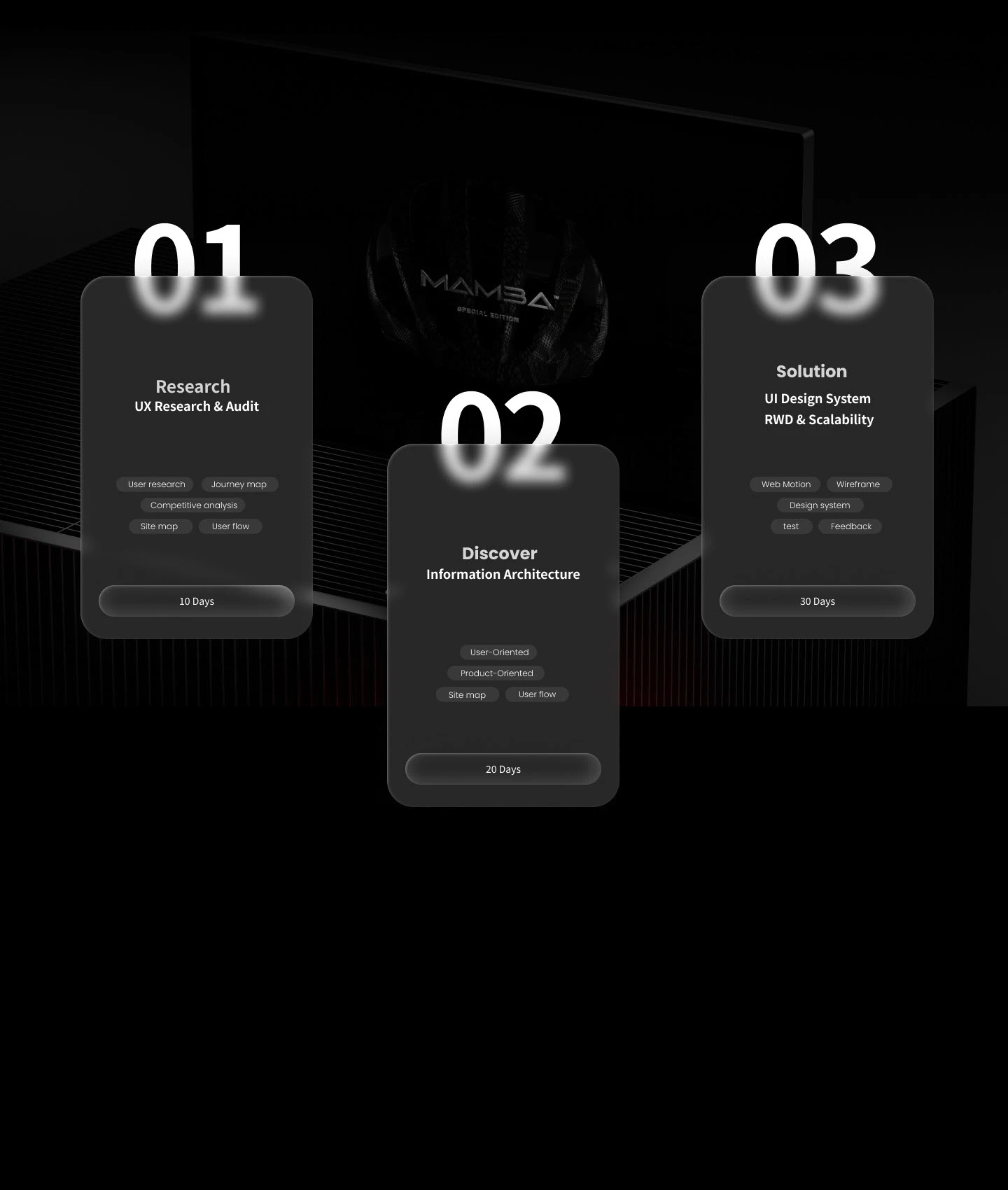
At the start of the three-month project, I grounded the direction in evidence before designing anything:
The clearest signal came from the competitive analysis: rival brands all led with atmosphere — a strong sense of brand and sport. KPLUS's old site was clean and functional, with everything it needed, but none of that mood came through. The gap wasn't features; it was feeling.
I synthesised all of it into a clear list of KPLUS's brand strengths and the gaps to close — the brief that everything afterwards had to answer to.
The benchmark asked a UX question, not an aesthetic one: which navigation model best fits how helmet buyers actually search? Five brands were assessed on information architecture — how products are classified, and whether navigation is built around user intent or catalogue structure.
The conclusion translated directly into IA: the menu borrows KASK and Cannondale's context and performance classification; the filter borrows On's in-listing model.
The starting point was user intent, not layout. The site served two distinct search behaviours. The goal-oriented rider already knows KPLUS and returns to replace equipment — a directed search for a known model and specification, for example a road helmet with MIPS. The style-oriented visitor arrives from social or advertising without a target — exploratory browsing, open to the range and to products that fit their riding context.
Directed search and exploratory browsing need opposite support, so the architecture provides both: a use-context menu (Road, City, and so on) gives the exploratory visitor a scent to follow, while a specification filter (MIPS, colour, size) lets the directed user narrow precisely. The menu supports discovery; the filter supports retrieval. Products previously three levels deep now sit two clicks from the menu.
UI research & audit — competitive analysis, original-site data, and where the brand was losing riders.
Rebuilding the IA so a product is two clicks away, not three — reachable straight from a navigation trimmed to four clear pages.
A UI design system and interaction language built for responsive behaviour and scale.
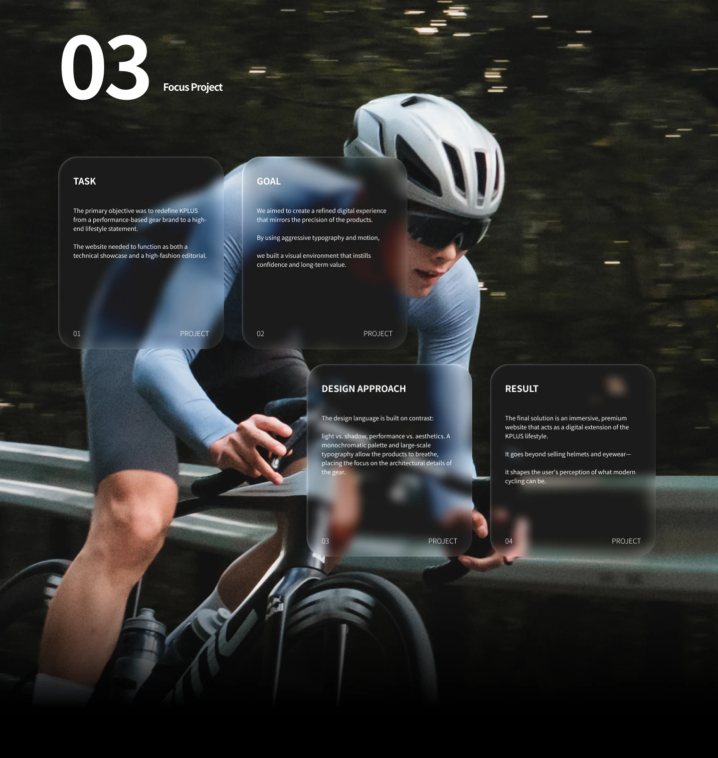
The visual direction was a decision in itself. Of four directions considered, I took the boldest — the most expressive, with real visual tension. The brand's core problem was a lack of presence, and only a charged direction would give it the atmosphere the old site missed — and signal the design ambition of a brand with international reach. The safe, conventional route was rejected for the opposite reason: competent but unremarkable, it would have repeated the flatness this redesign existed to fix.
Each interaction answered a specific problem from the research — decoration was never the goal:
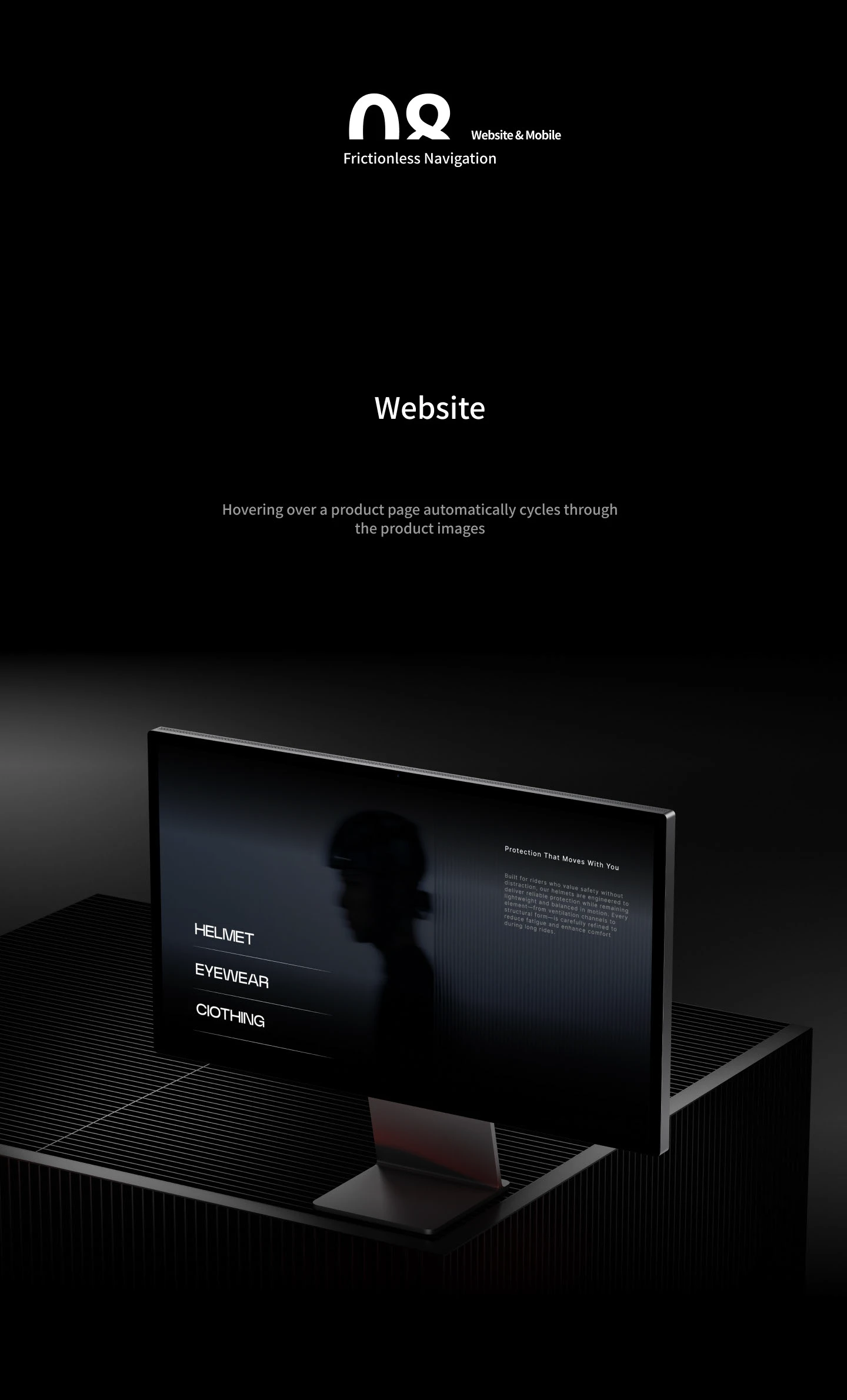
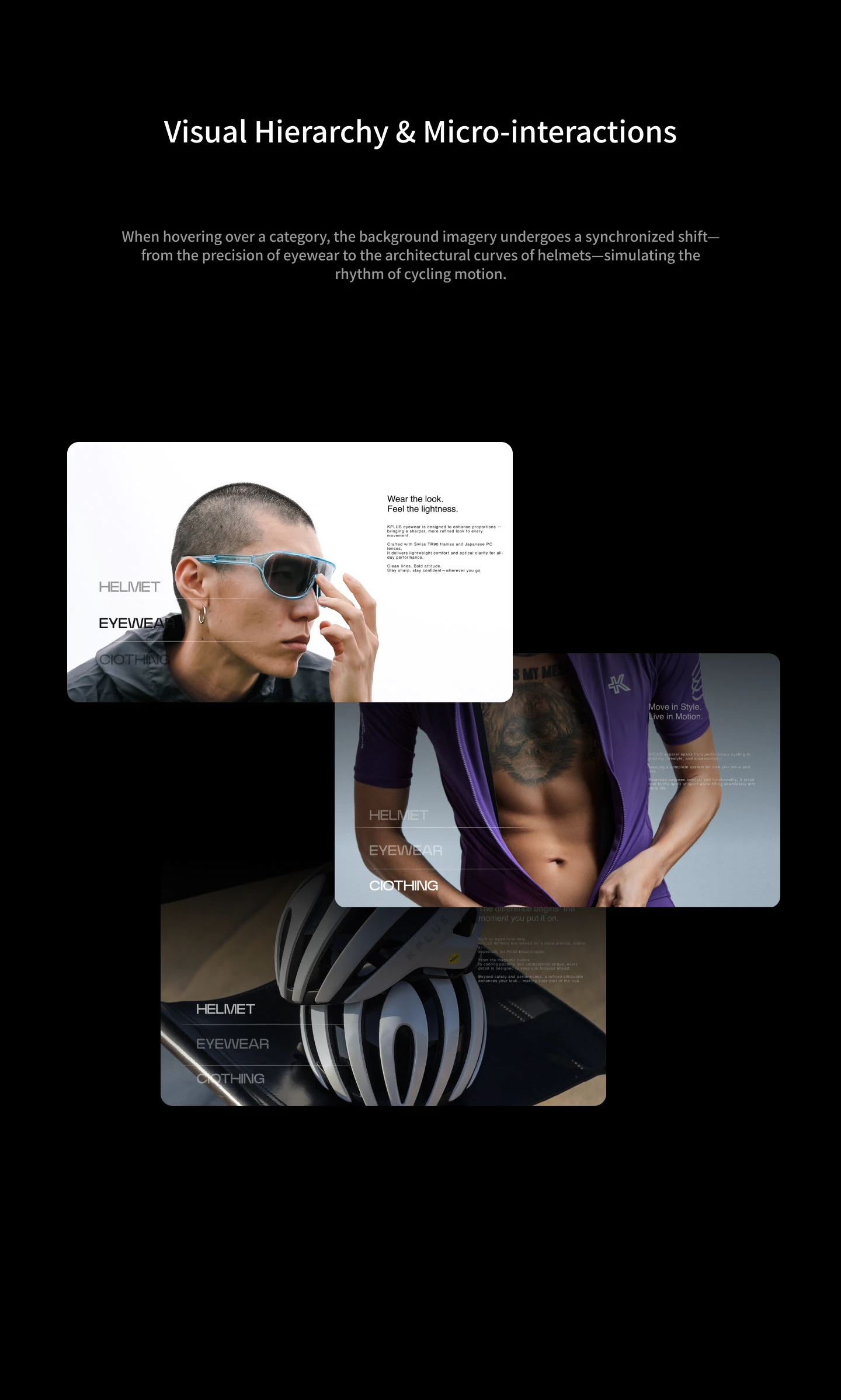
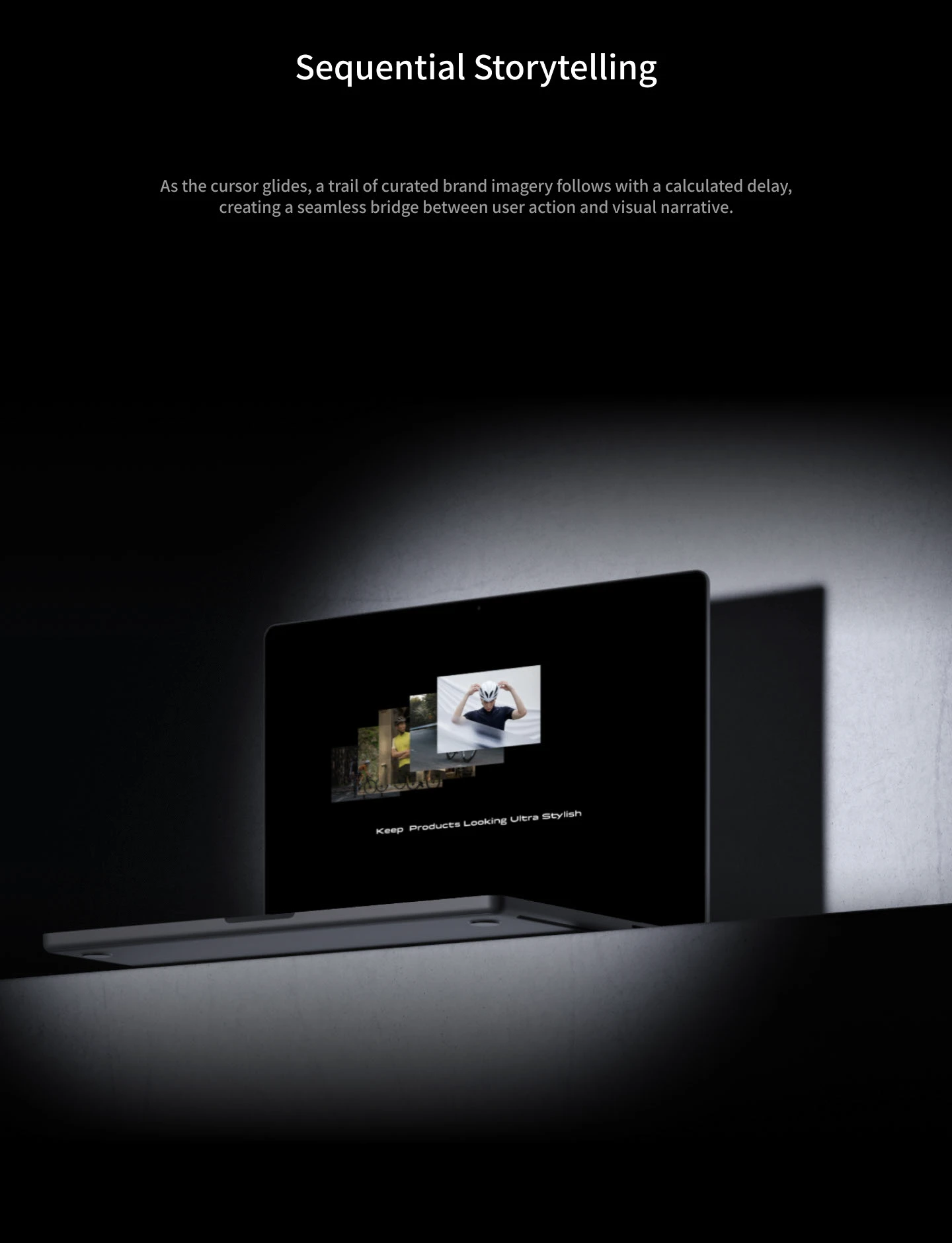
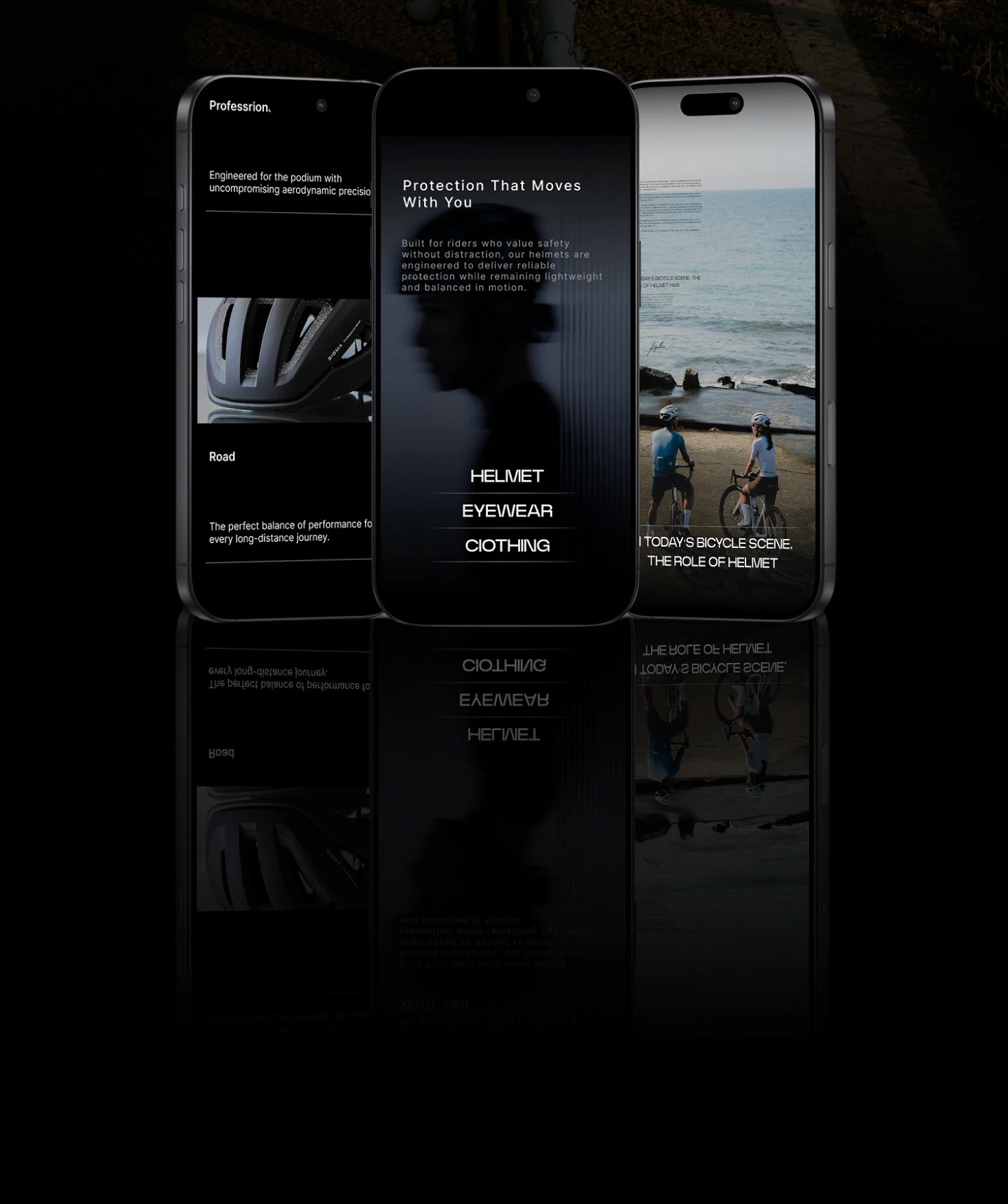
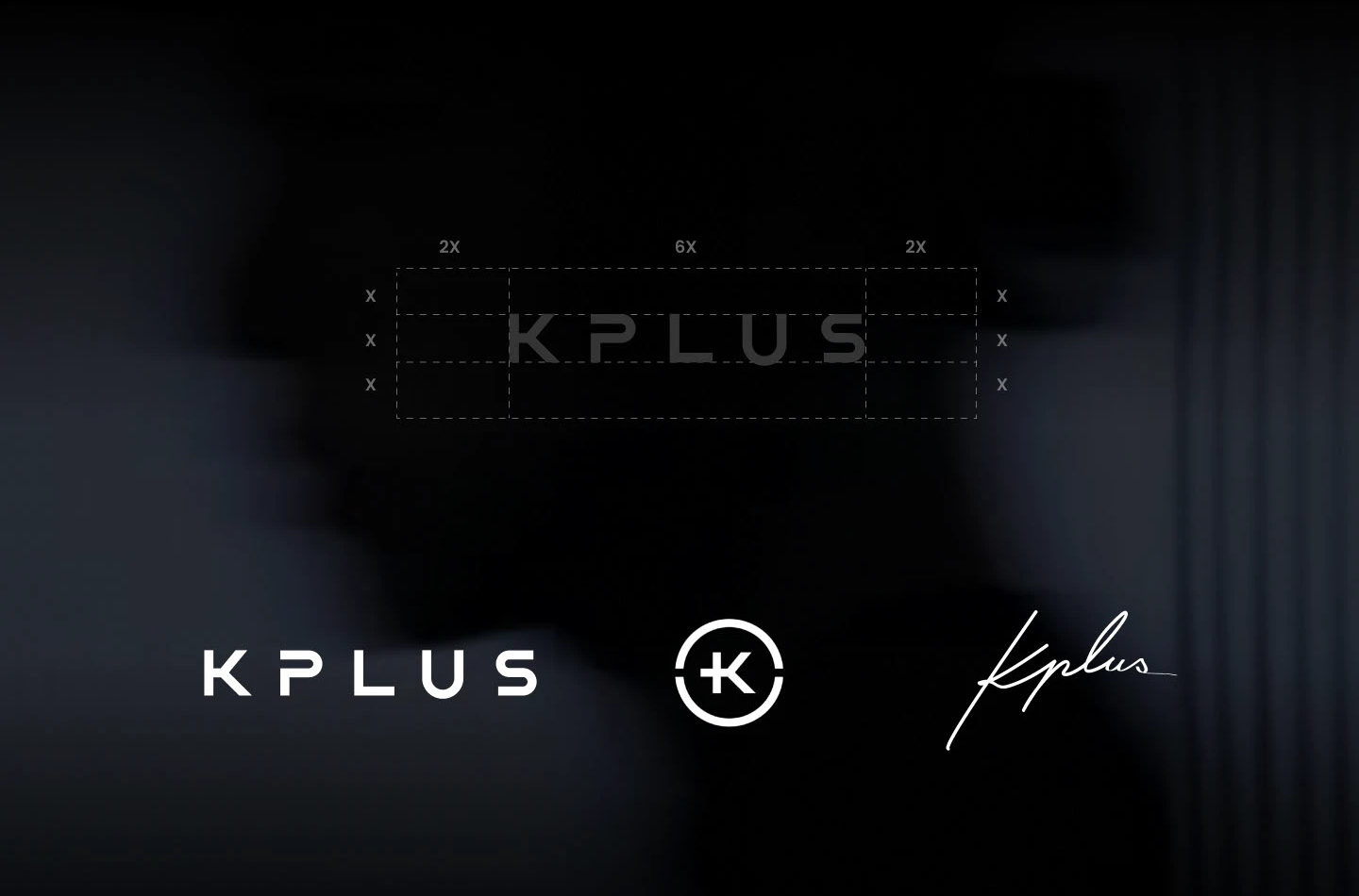
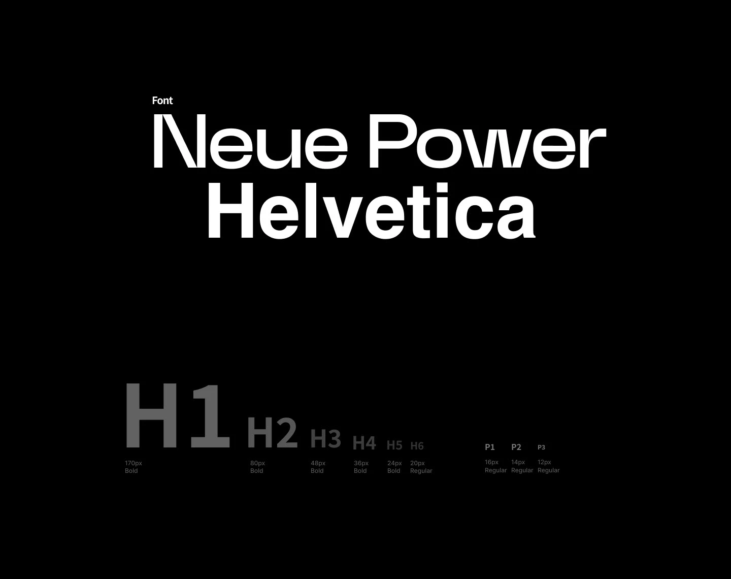
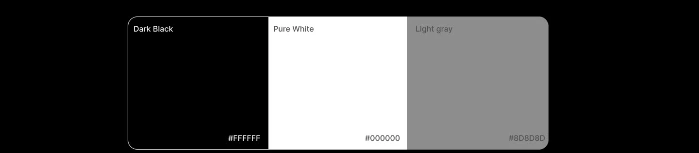
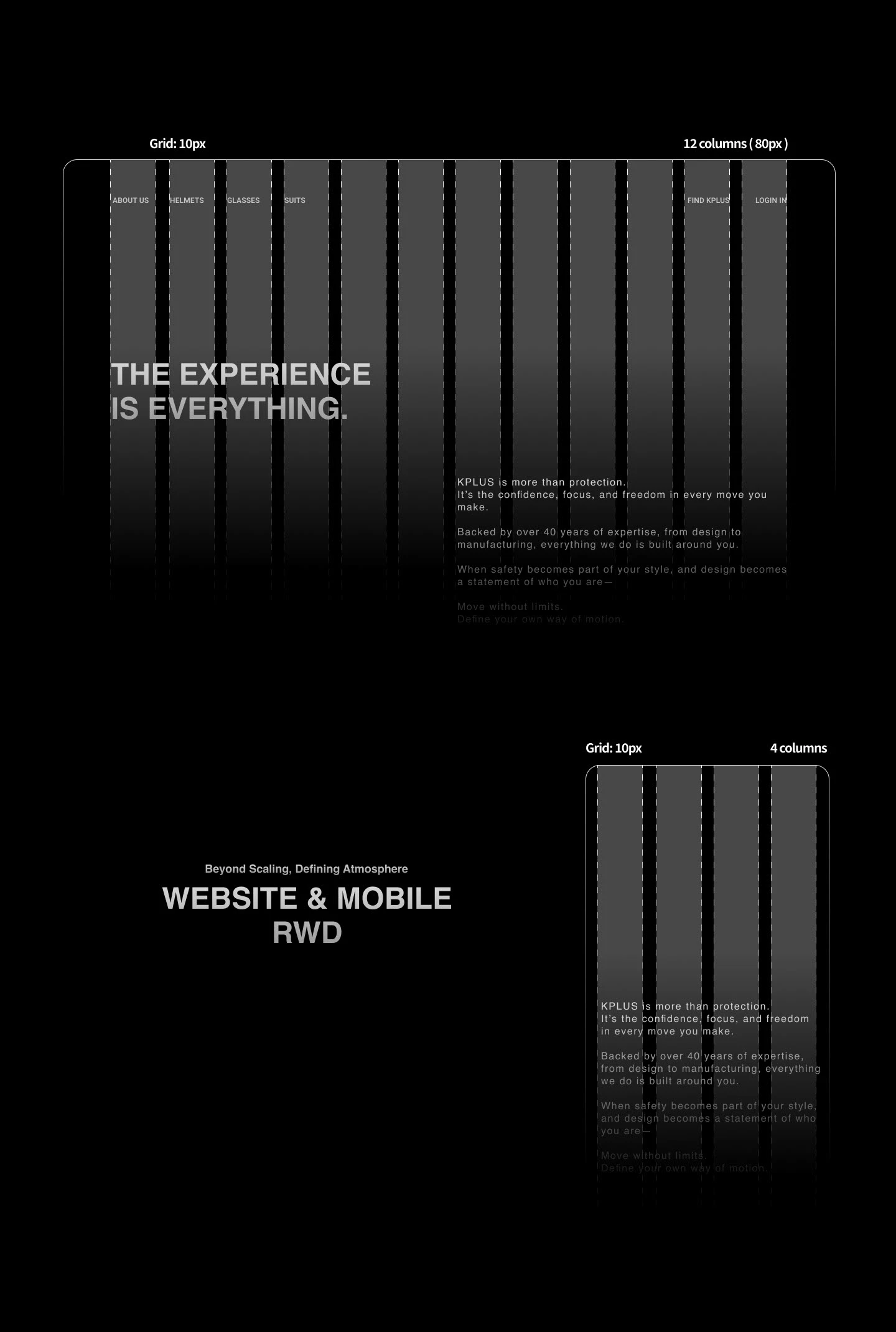
The identity is deliberately restrained — a system, not a sticker. A refined KPLUS wordmark and monogram, Neue Power paired with Helvetica, a near-monochrome palette of deep black, pure white and a single grey, all held on a 10px, 12-column grid.
Neue Power — a wide, confident grotesque — carries the brand's character in headlines, while Helvetica stays neutral in body and specs, so personality never competes with legibility. The near-monochrome palette hands colour back to the product and the photography: on a black stage, the helmet reads as the hero, not the interface. The 10px, 12-column grid is the system's backbone — one consistent unit keeps spacing rhythmic across breakpoints, and twelve columns divide cleanly for responsive layout and a clean engineering handoff.
The system doesn't stop at the website. The same restraint and atmosphere carry into out-of-home billboards and premium packaging — every touchpoint crafted to make the brand journey feel seamless and high-end.
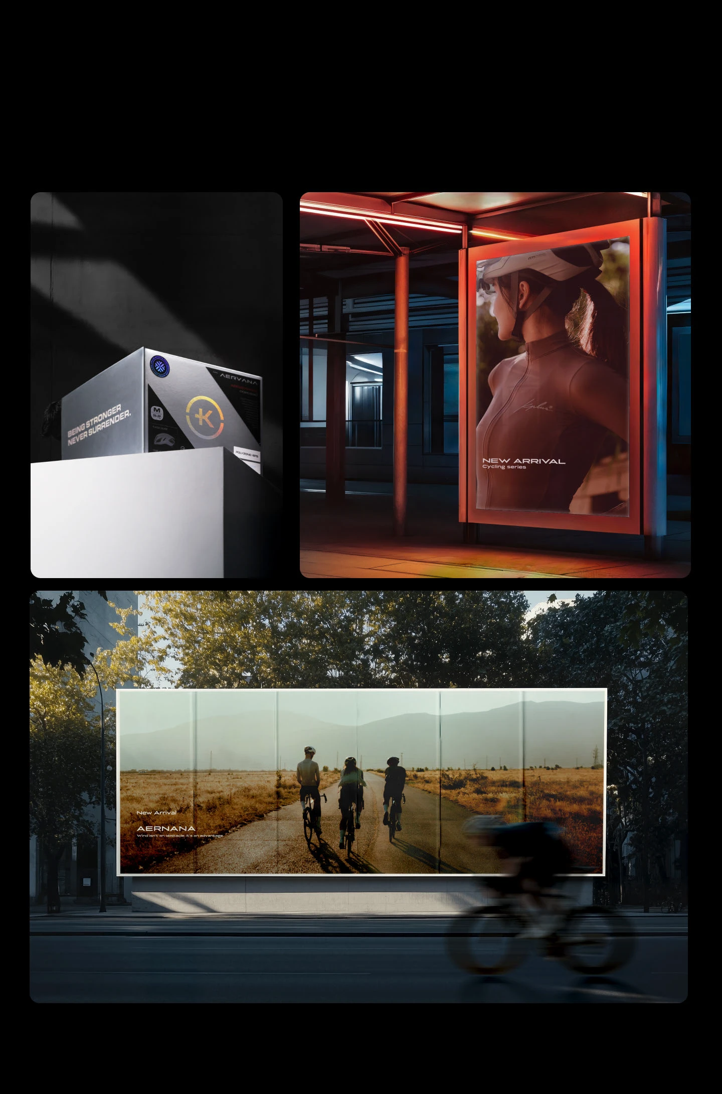
I was the only designer, building alongside a single engineer — so communication carried a lot of the weight. I regularly sat with other departments to understand their problems and needs, then translated those into screens.
With the creative director and engineer, motion was refined in tight loops — screen requirements, effects, timing and smoothness adjusted back and forth until it both felt right and ran well. Designing within those constraints, not despite them, is what kept the build realistic.
Reflection: the redesign held together because it began as a diagnosis, not a style. Every interaction had to answer a named problem — which is also what made it easy to defend to the team and sign off.
(Design goals) Success is measured, not assumed: fewer clicks to reach a product (3 → 2, done), a smoother and faster mobile experience, and a brand presence that finally feels as sporty and premium as the helmets themselves. The post-launch numbers now bear these out — see next.
No guessing — the real numbers. After launch, GA4 shows each of the original design goals turning up in actual user behaviour.
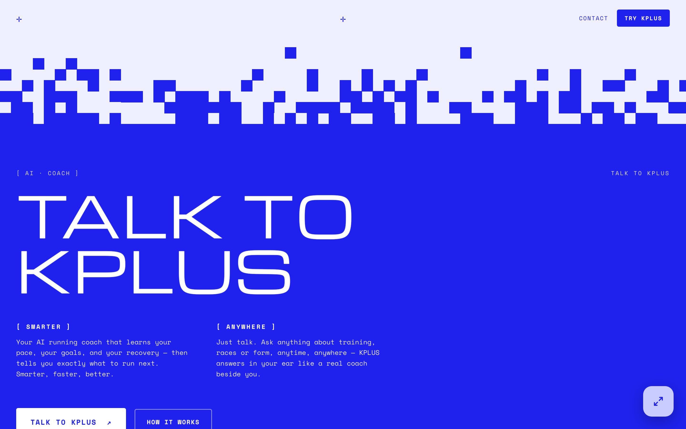
A separate direction explored for KPLUS: a voice-first AI running coach landing. Where the brand site stays cinematic and restrained, this surface takes the opposite, louder route — an electric-blue brutalist direction with a pixel-dither transition, wide techno display type and mono labels, built to feel technical and confident.
It's a deliberate contrast inside one brand: a calm, premium product surface and a loud, expressive front door, tied together by a single signature blue.
If I rebuilt it today, I'd drive the motion from mobile performance first — choosing each effect and transition by how smoothly it runs on a phone, then scaling up to desktop, instead of designing rich motion and trimming it back for mobile. Let the phone decide the motion, not the other way around.