A running crew's identity, worn on the body — not just printed on it.
Taipei Running Club had a line — break the record — and nothing to carry it. I built the mark and apparel the crew actually wears: training, races, every week.
A running club is a community before it's a logo. So I designed the identity to be worn — a mark and a line that mean something when you're on the start line next to your crew.
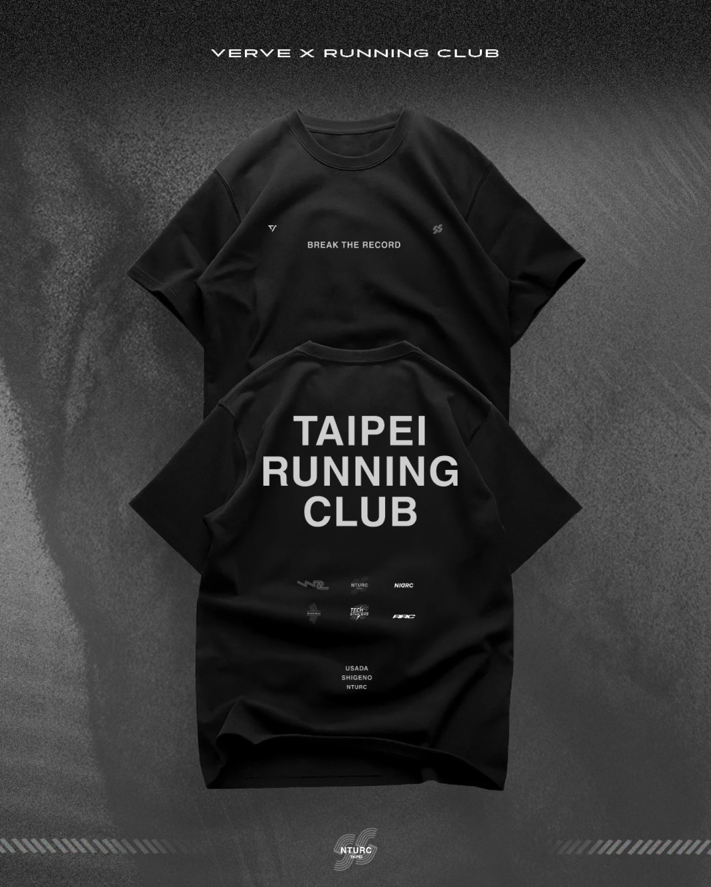
Break the record sits at the centre — the club's ambition, said plainly.

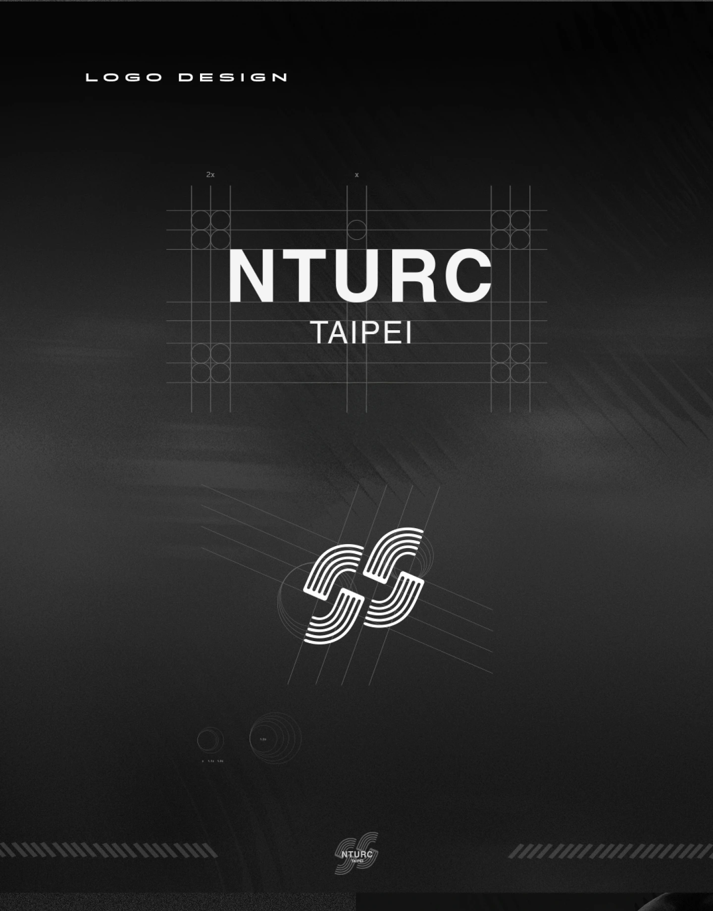
The NTURC monogram folds two strokes into one running figure — you read the motion before the letters.
Paired with plain, minimal type, it gives members and partner crews one mark to line up behind.

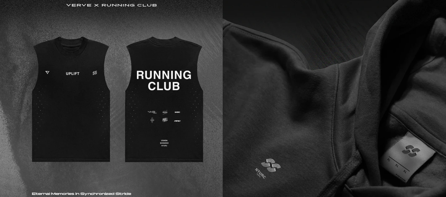
The system carries onto race kit — a tank for training, a jacket for the cold mornings. The mark stays quiet, so the apparel reads as kit, not merch.

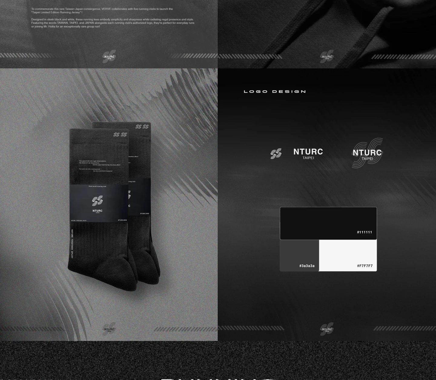
Down to the smaller pieces — socks, cards, the badge language. Same black, same monogram, so every touchpoint belongs to the same crew.

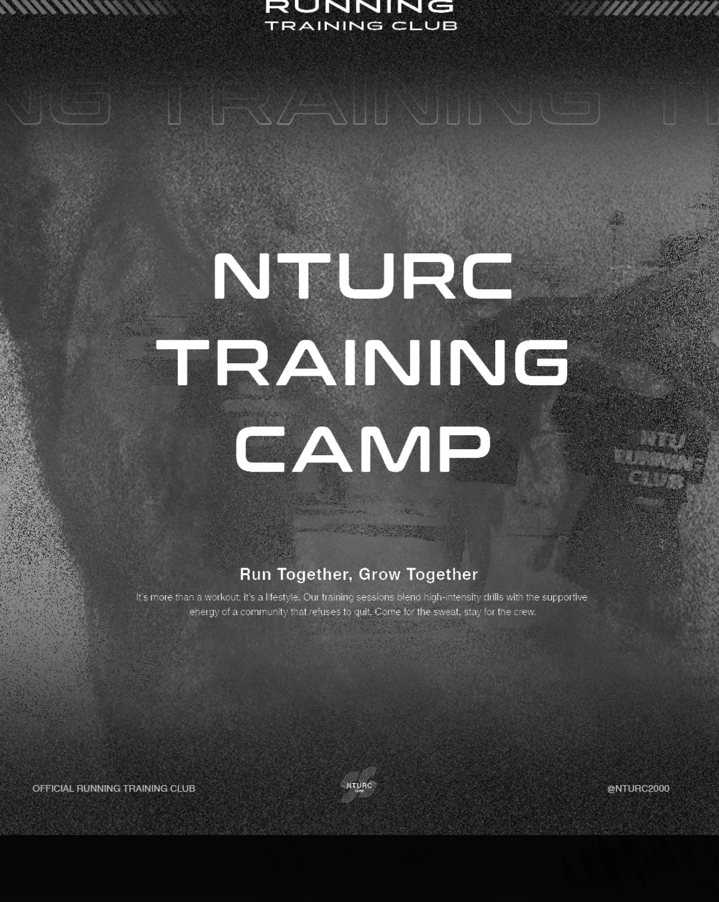
NTURC Training Camp turns the brand into an event. Run together, grow together frames the club as something you show up for — not just something you wear.

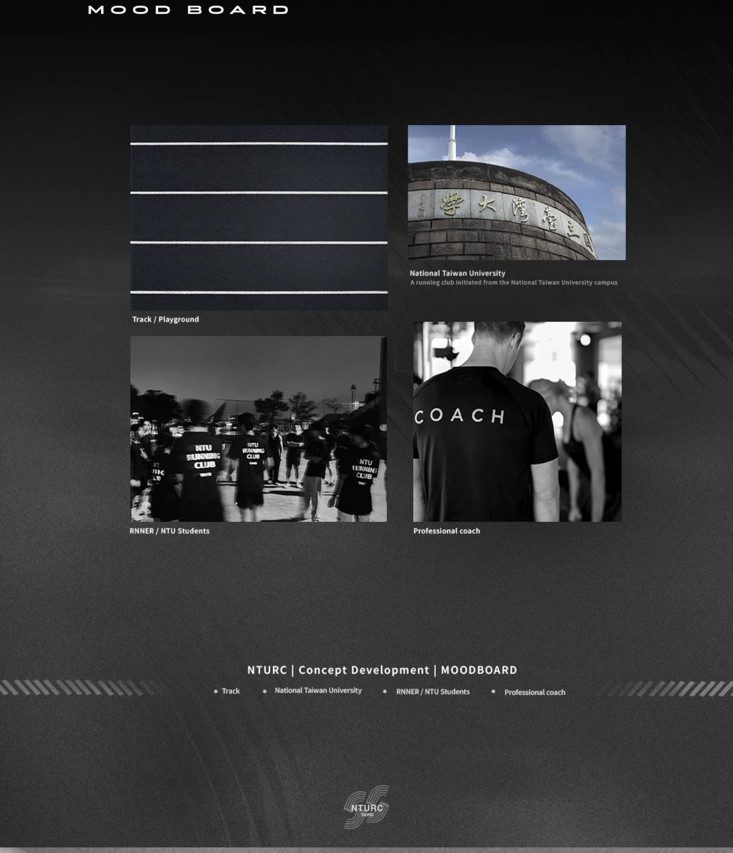
The direction came from the club's own world — campus, track, early light, the people who actually run. The moodboard kept every later choice honest to that.

A crew's identity only works if people actually wear it. The goals:
Trade-off & reflection: success here was never whether the logo looked good — it was whether a runner would actually choose to wear it. So every decision was tested against one practical question: would someone put this on, unprompted, and run in it? The design serves belonging, not decoration.
Want the complete design boards, in full resolution?
See the full case on Behance ↗︎