ZERO is not just a running club — it's a community built through branding, storytelling and real experiences. Run like a product, where the designer, engineer and runner behind it are the same person.
Not a flyer — a product that actually runs.
The site has two modes: Action (find a run, sign up) and Drift (read the journal, feel the crew). The race guide is fed by a real data pipeline that cites its source; the signup runs on a backend I built myself — form to Google Sheet, with automatic confirmation emails. All of it is live — embedded below, fully interactive.
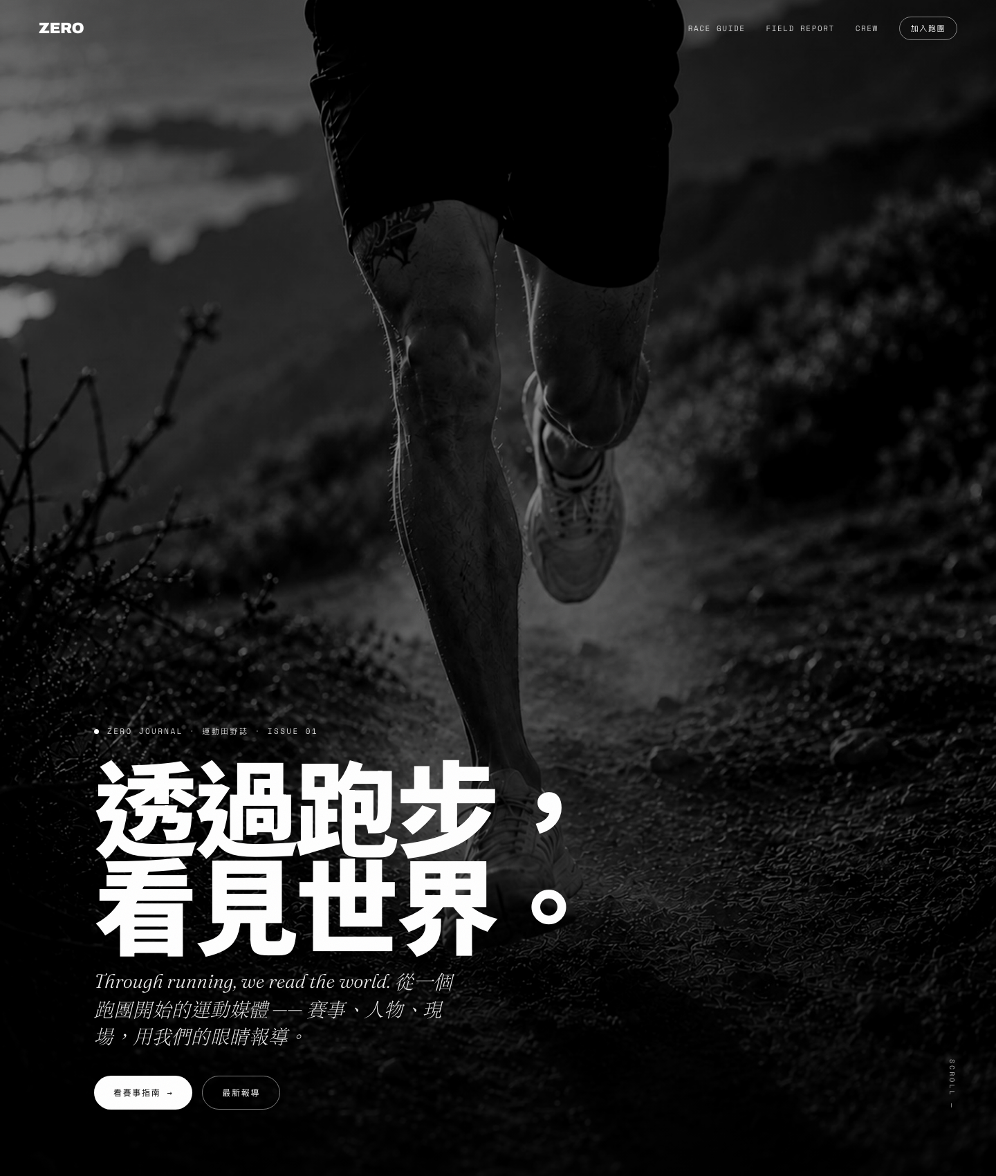
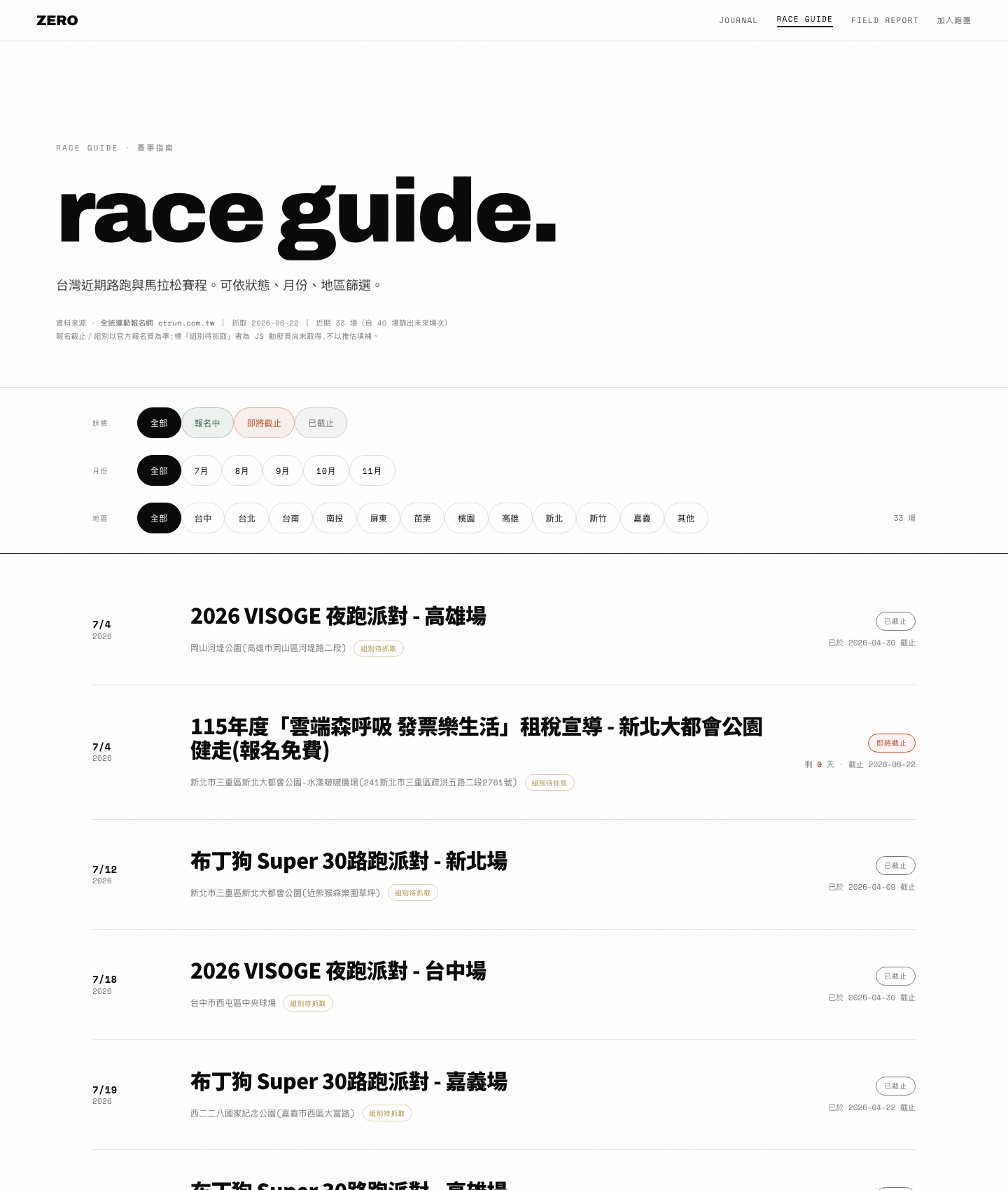
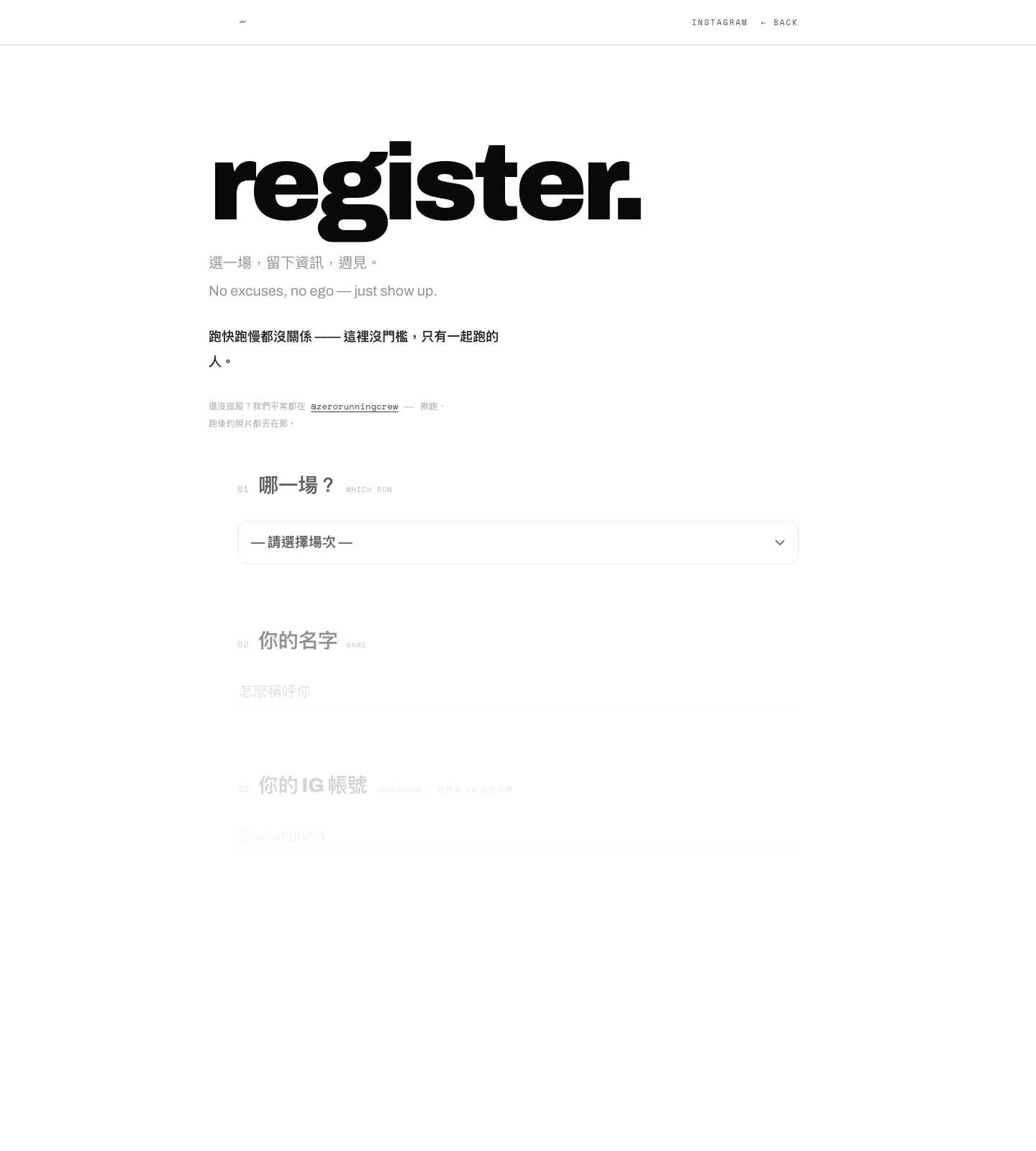
Content is where the brand actually lives.
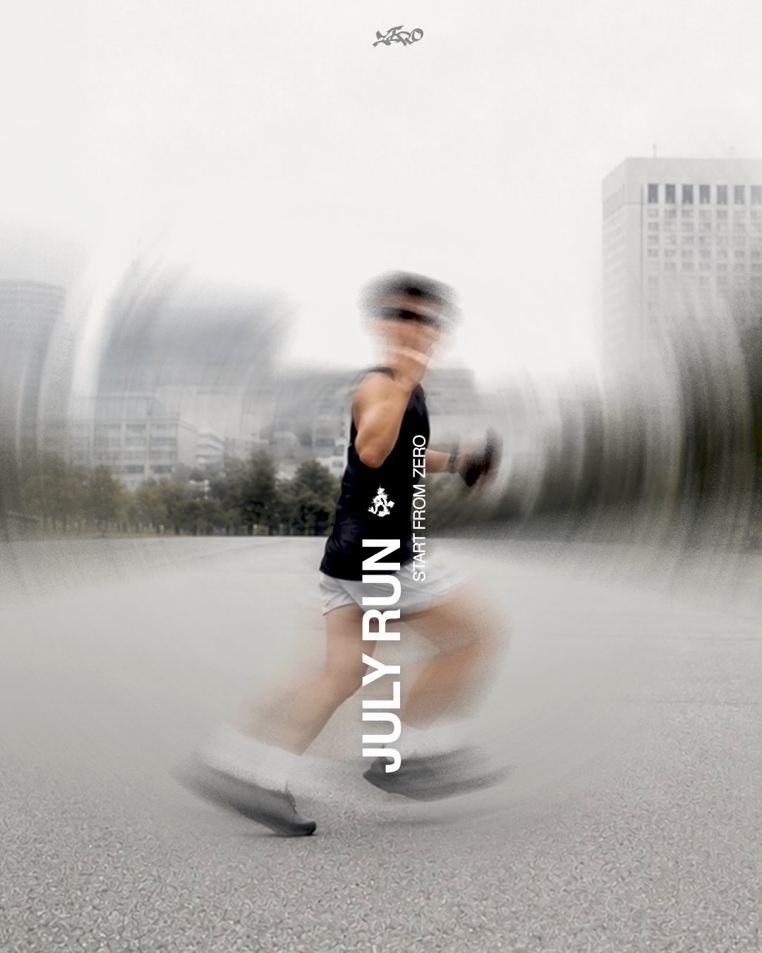
This wall is the current feed at @zerorunningcrew — pulled straight through an Instagram Graph API pipeline I built, not a mockup. The voice came from analysing 31 of my own real posts: short lines, lowercase English, no hashtag clutter — so the grid reads as one brand at a glance.
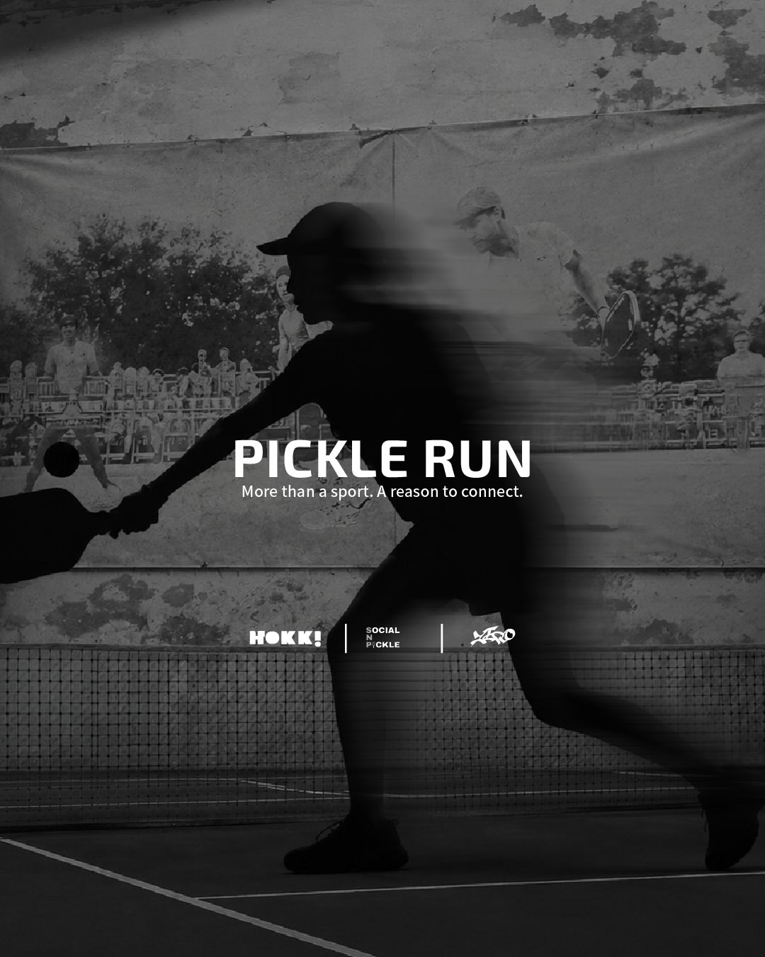
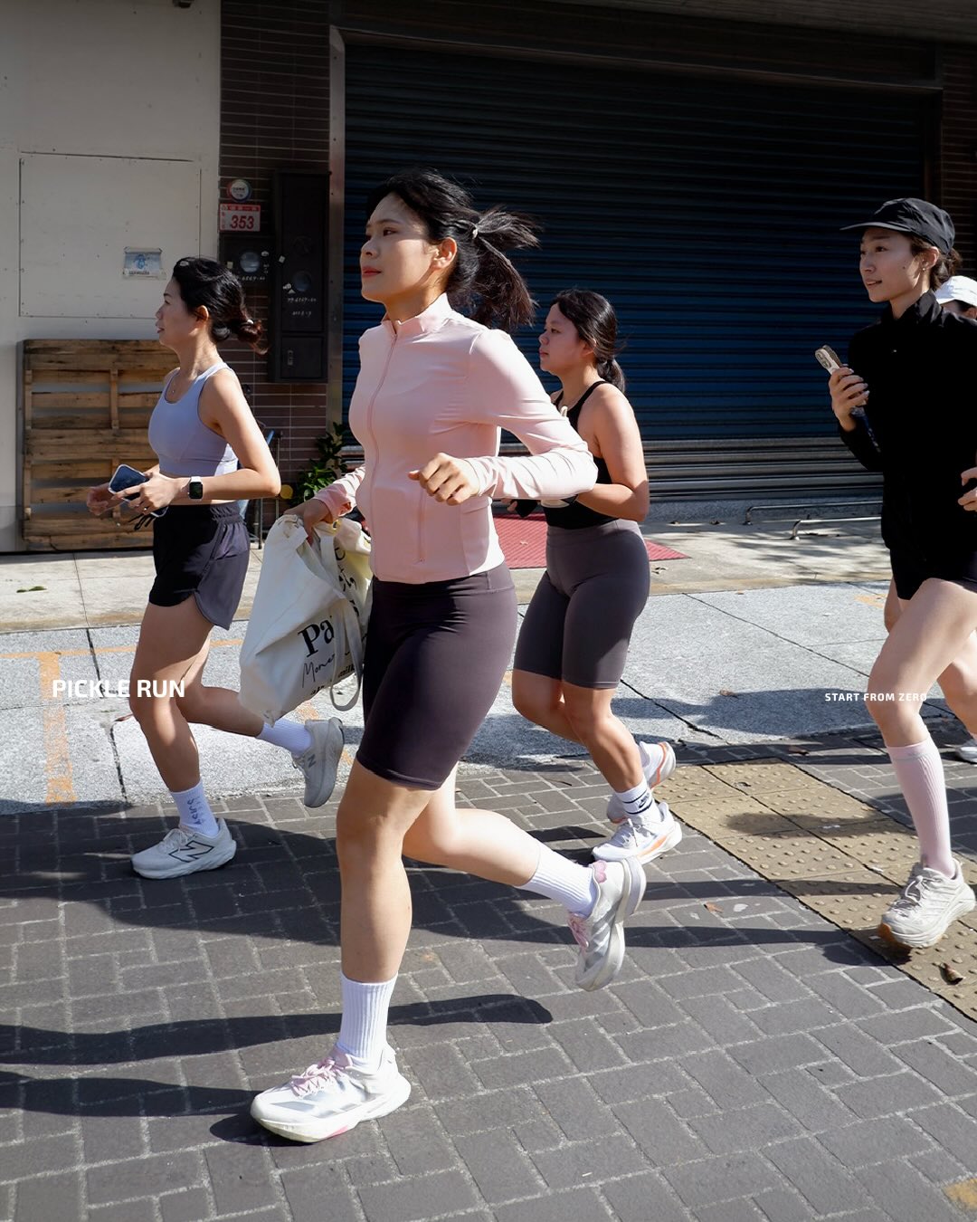
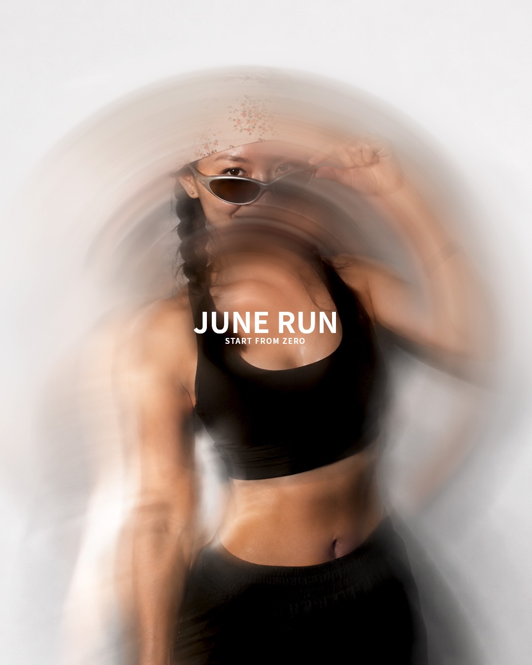
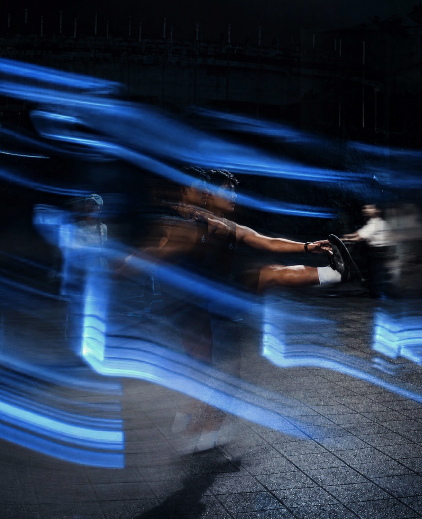
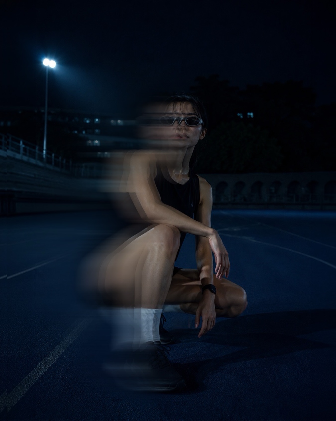
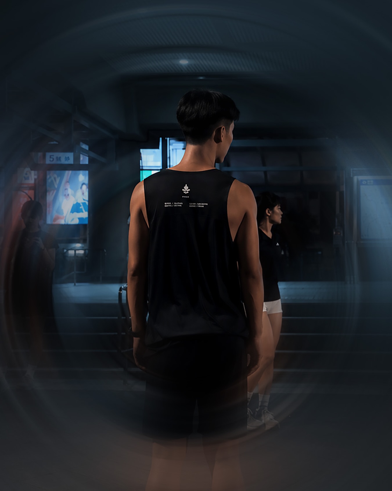
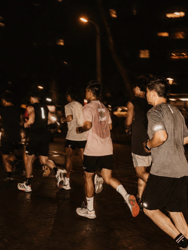

Instagram sets the tone; Threads is what makes it travel — that's the growth engine. On 1,481 followers, the account has pulled 392,000 views; one night-run recap alone reached 207,000 — about 140× the follower count. Reach that outruns the audience is the point: the writing does the work, not an ad budget.
Before every run, the watch reads 0000. That's where the name came from — start from zero.
The whole brand grows from one idea: no pace to prove, no ego, carry nothing. Zero isn't where you end up — it's where you choose to begin. Again.
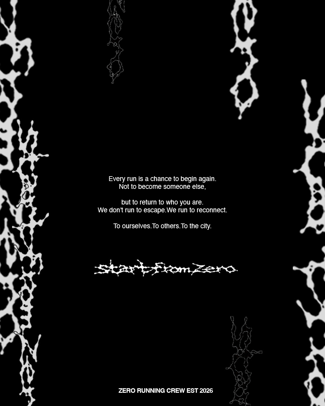
One cold frame, holding a lot of spiky individuals.
I explored a lot of names and logos first. The easy path was clean — one neat wordmark and done. I chose the opposite: a mark drawn by hand, because that's the grassroots, original thing a crew actually is. The runner in the logo carries spikes — each spike is a person with their own edges. A restrained, minimal system (the frame) holds these independent, spiky people.
The primary mark is the type-driven "start from zero" lockup — clean enough to sit on a watch face, a race bib, a hang tag. The spiky mascot, the graffiti wordmark and a custom display typeface are the expressive layer — for apparel, posters and stickers.

The system itself is deliberately restrained: high-contrast black and white, film grain. It pairs a heavy Archivo with Space Mono for the system, and a custom display typeface I drew for the expressive layer. The motifs come straight from the ritual — 00:00:00, carry nothing, a single 0. No soft, friendly shapes; the restraint is the attitude.
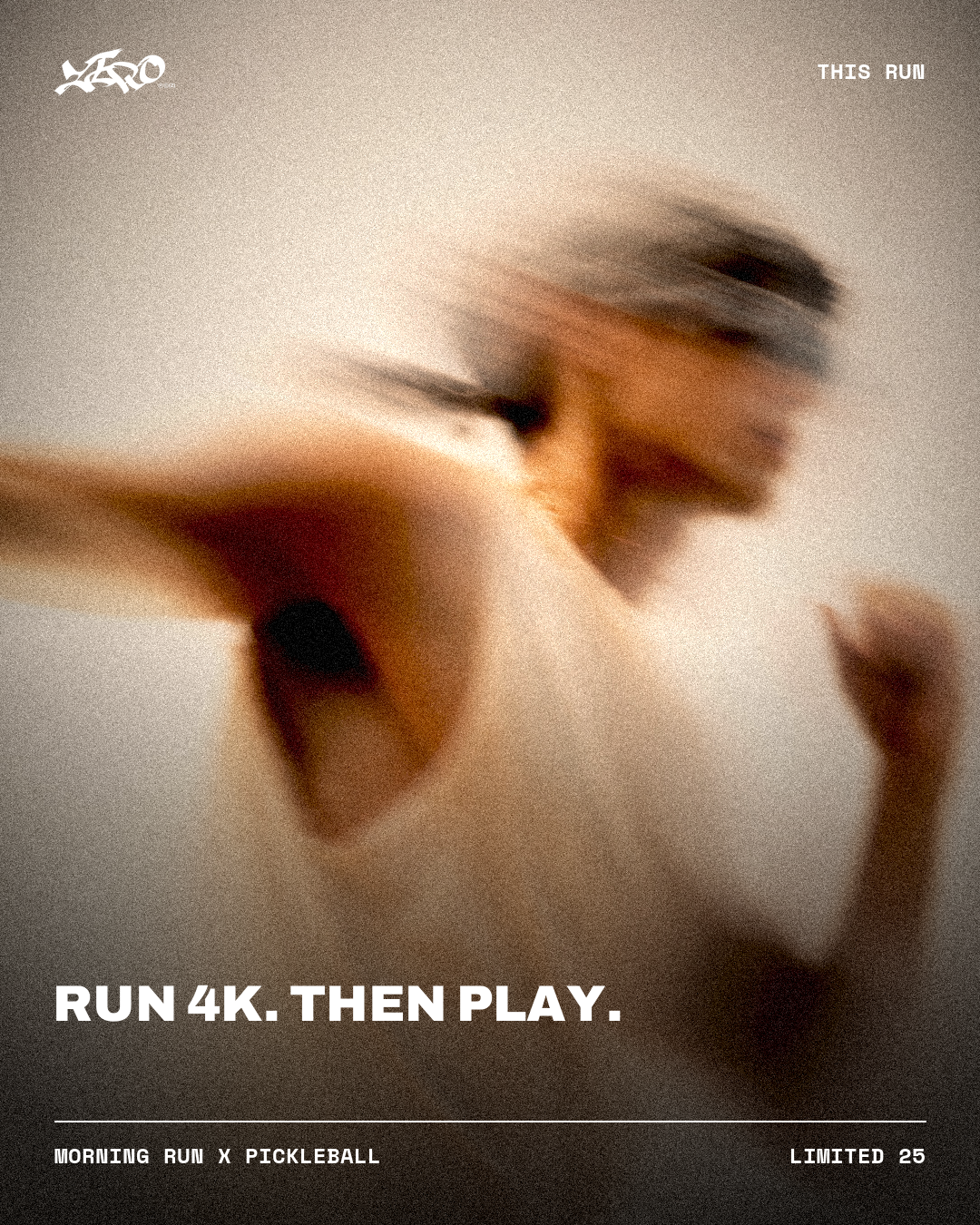
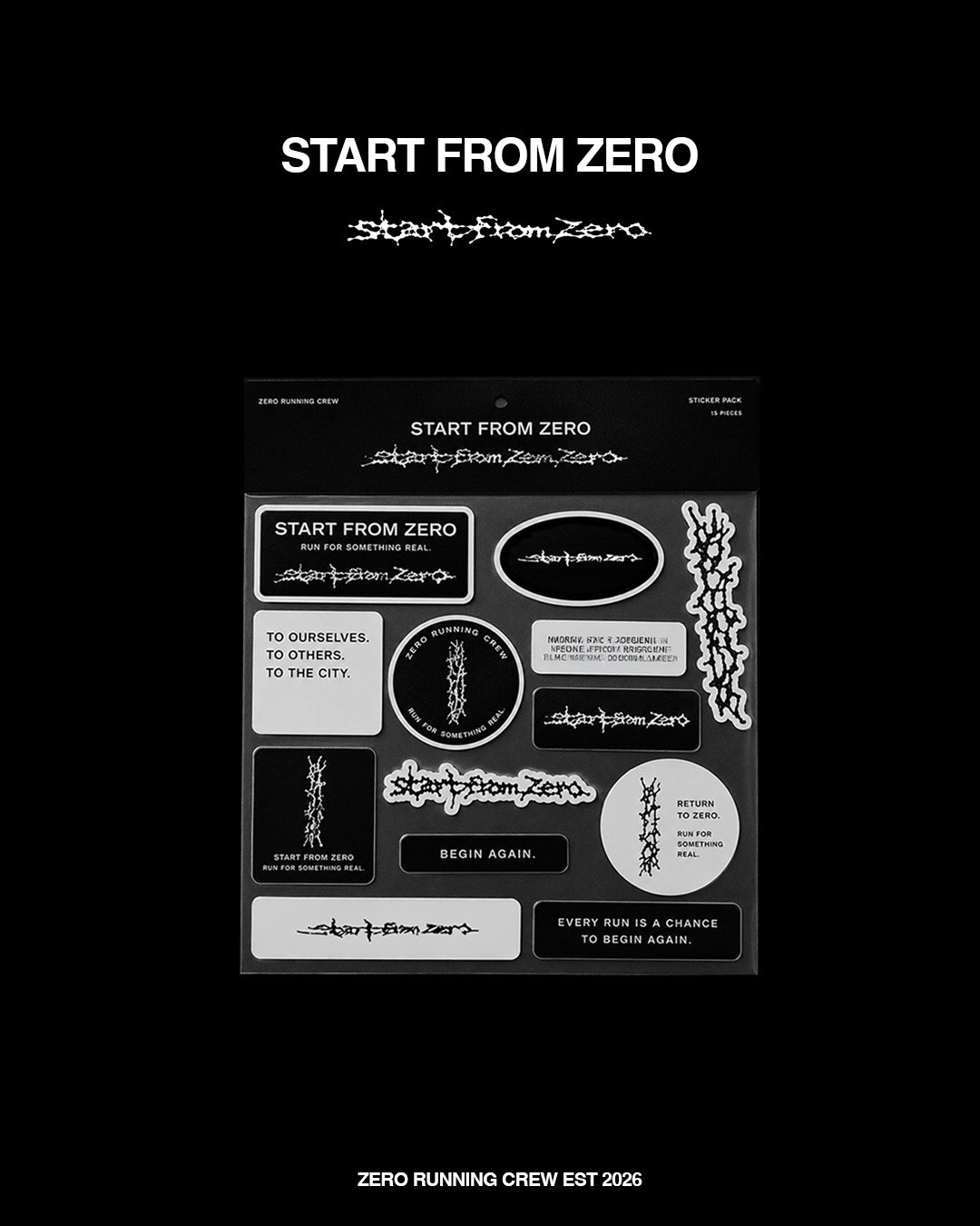
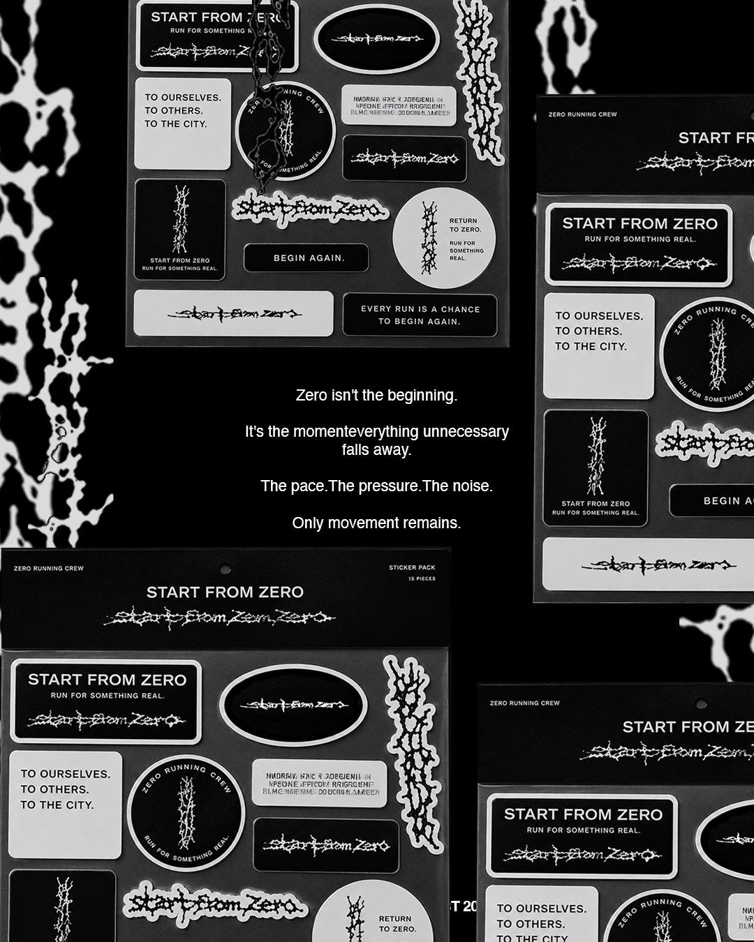
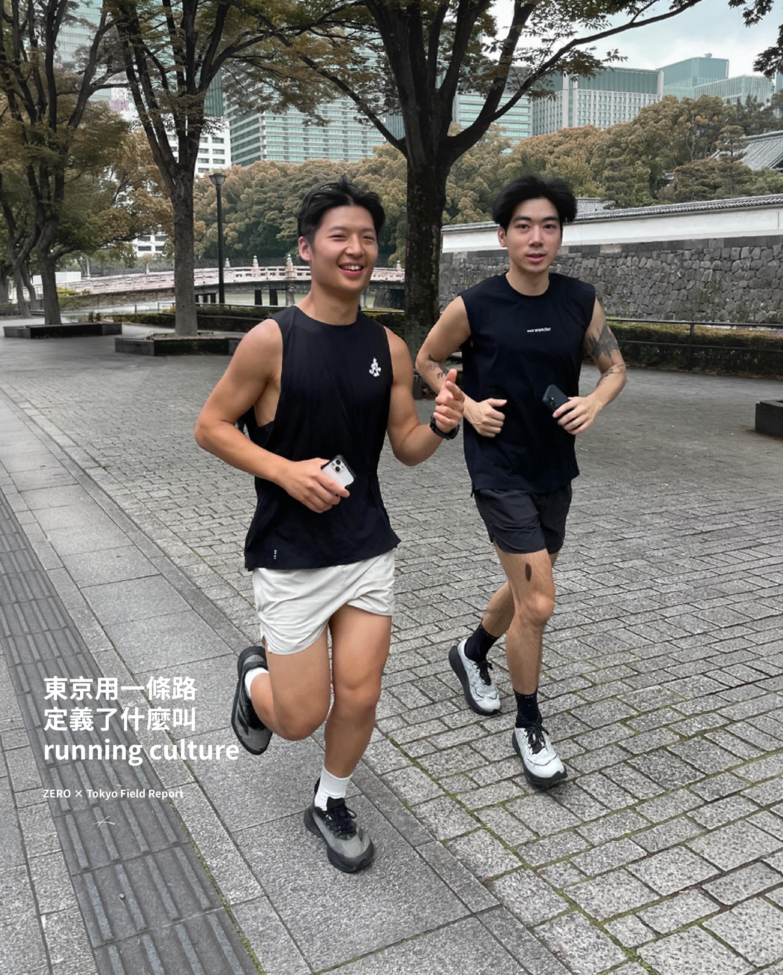
The identity lives where the crew actually shows up — on stickers, kit, posters, and on the road all the way to Tokyo.
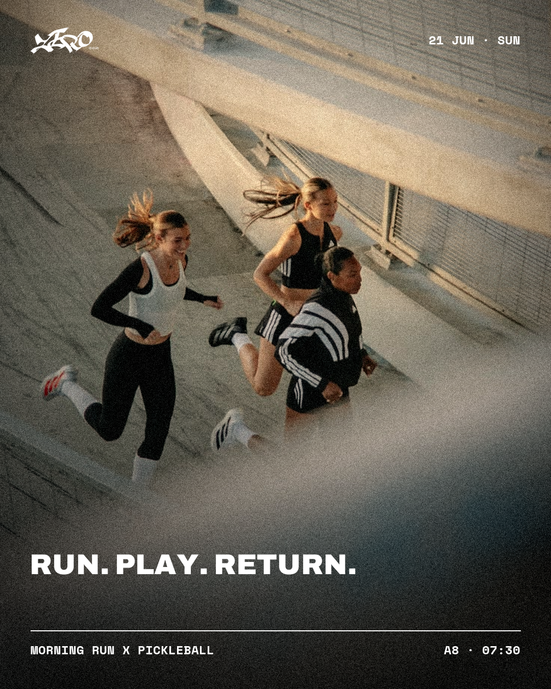
None of it matters if no one shows up.
ZERO turns the online brand into real Sunday-morning runs — people who found a crew, not just an account. The brand exists to get a stranger to a start line, then make them want to come back.
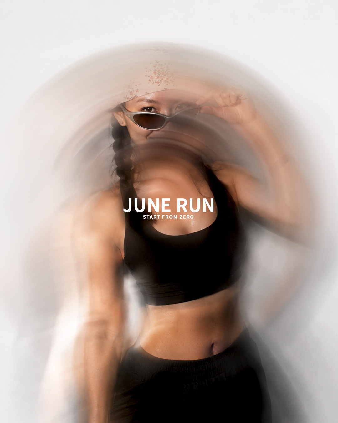
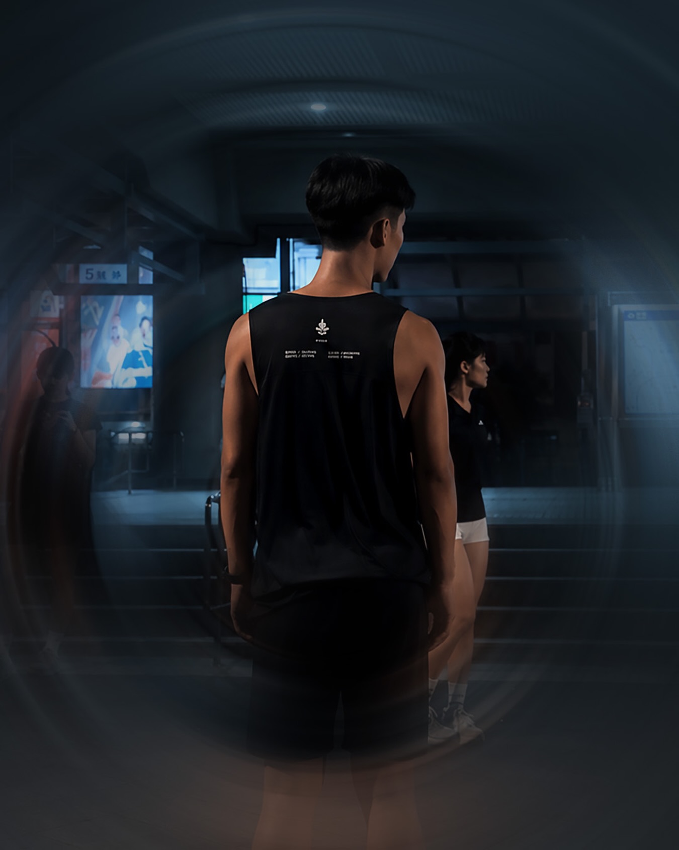
Behind the brand is an engine, not hustle.
A private dashboard pulls Instagram and Threads data on a schedule, so growth decisions are read off real numbers, not a gut feel. The whole thing runs as a loop — shoot, design, publish, measure, repeat — so each week sharpens the next.
ZERO is the clearest proof of how I work: I don't hand off at the mockup. I carry a real problem the whole way — brand, front-end, backend, content, and the data to grow it — as one person. It's the same way I'd work inside a team, just with no one to pass it to.
And whether it works isn't measured in followers — it's measured in who actually shows up: around twenty runners on the line each week, held together by a core of three. The online brand became a real Sunday morning.
If I rebuilt it today, I'd lock the styles and the team first.
A lot of ZERO grew on the move. Rebuilding it, I'd define each visual style more sharply up front, and set the team and roles earlier — so the brand scales by design, not by improvising.