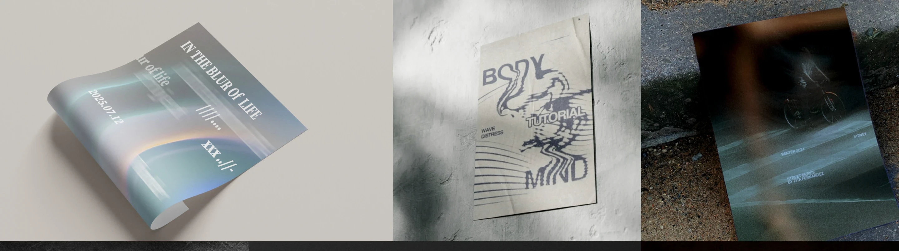
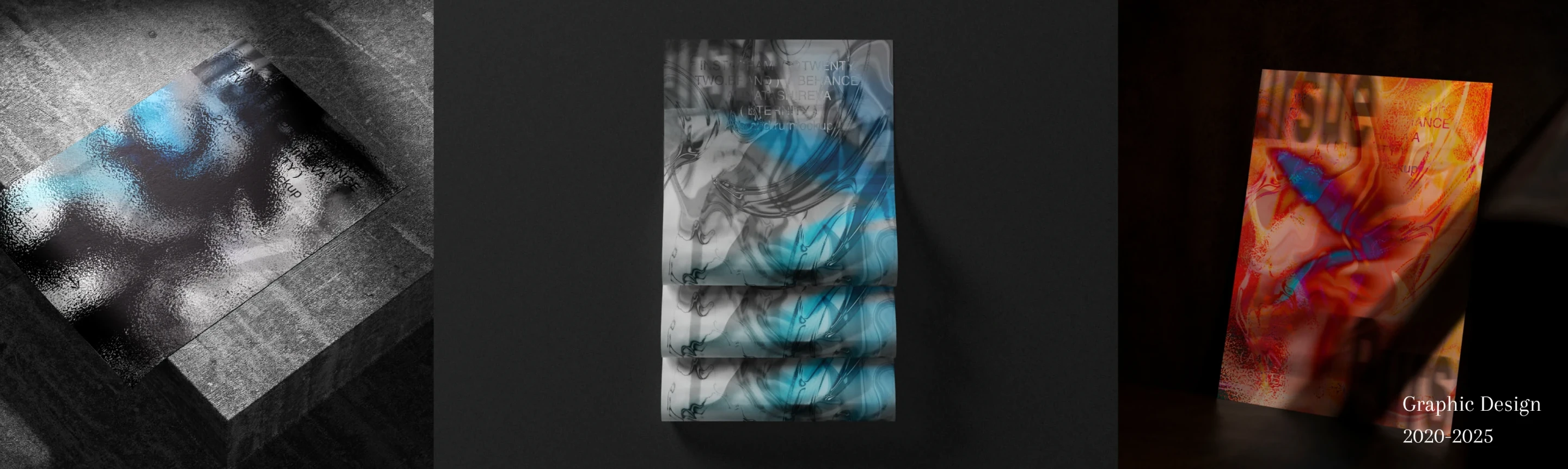
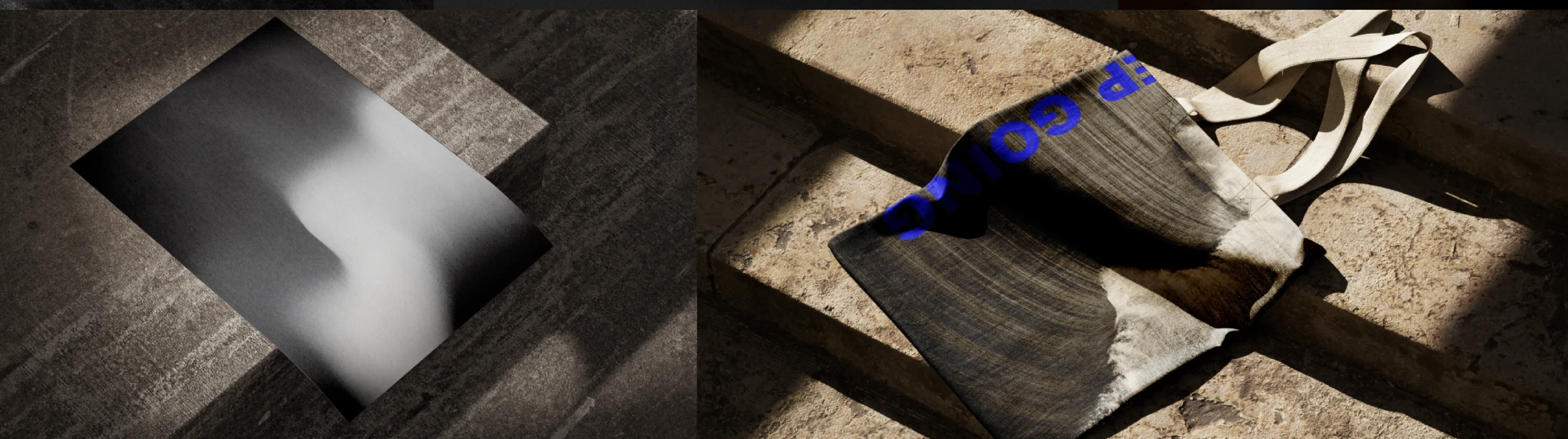
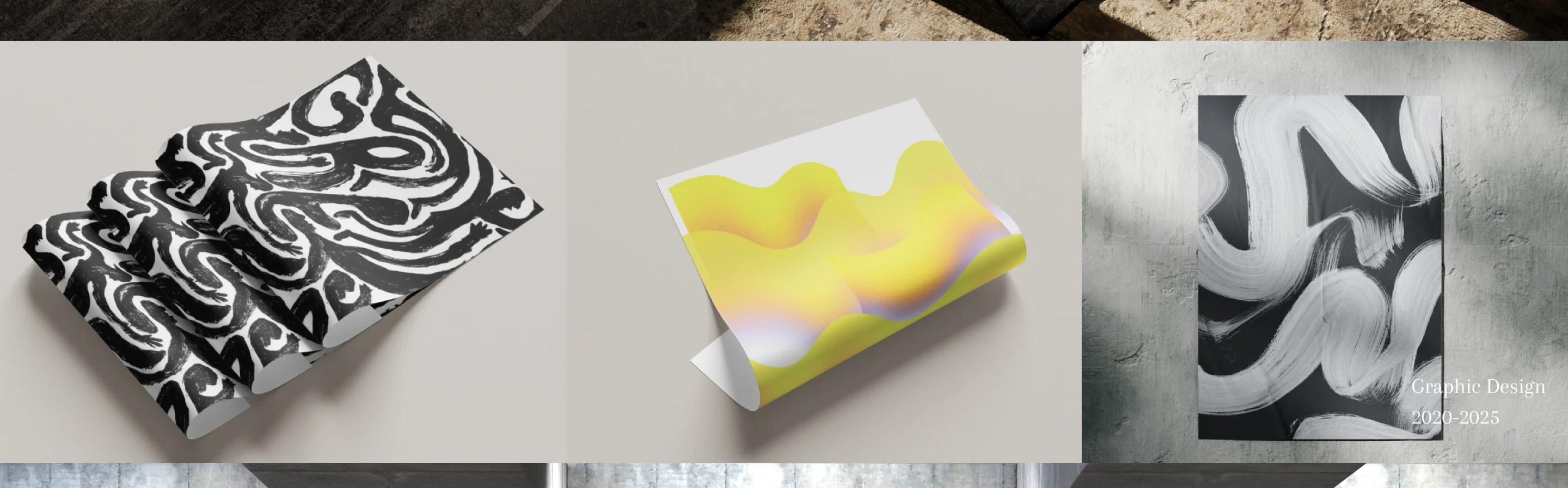
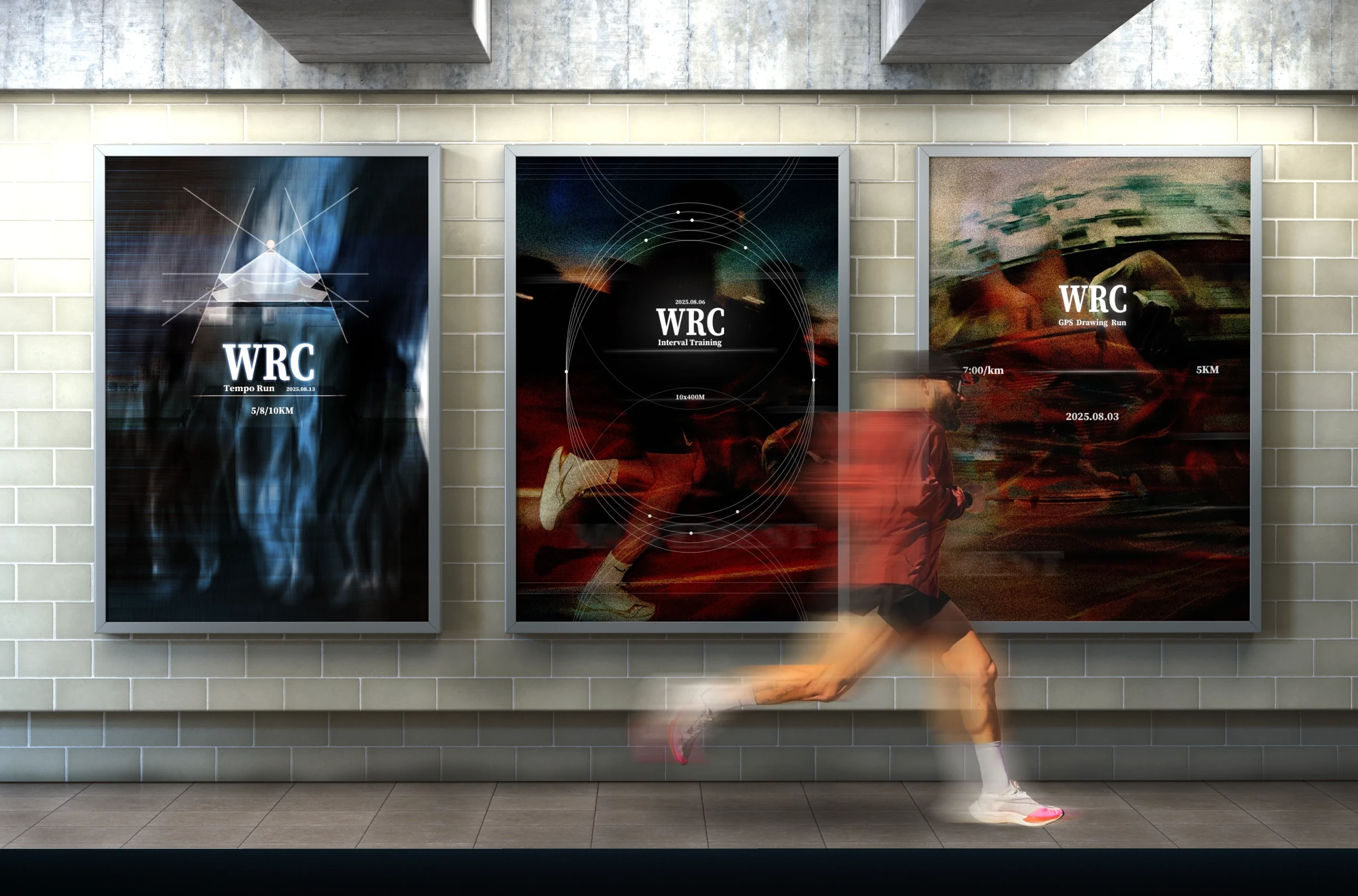
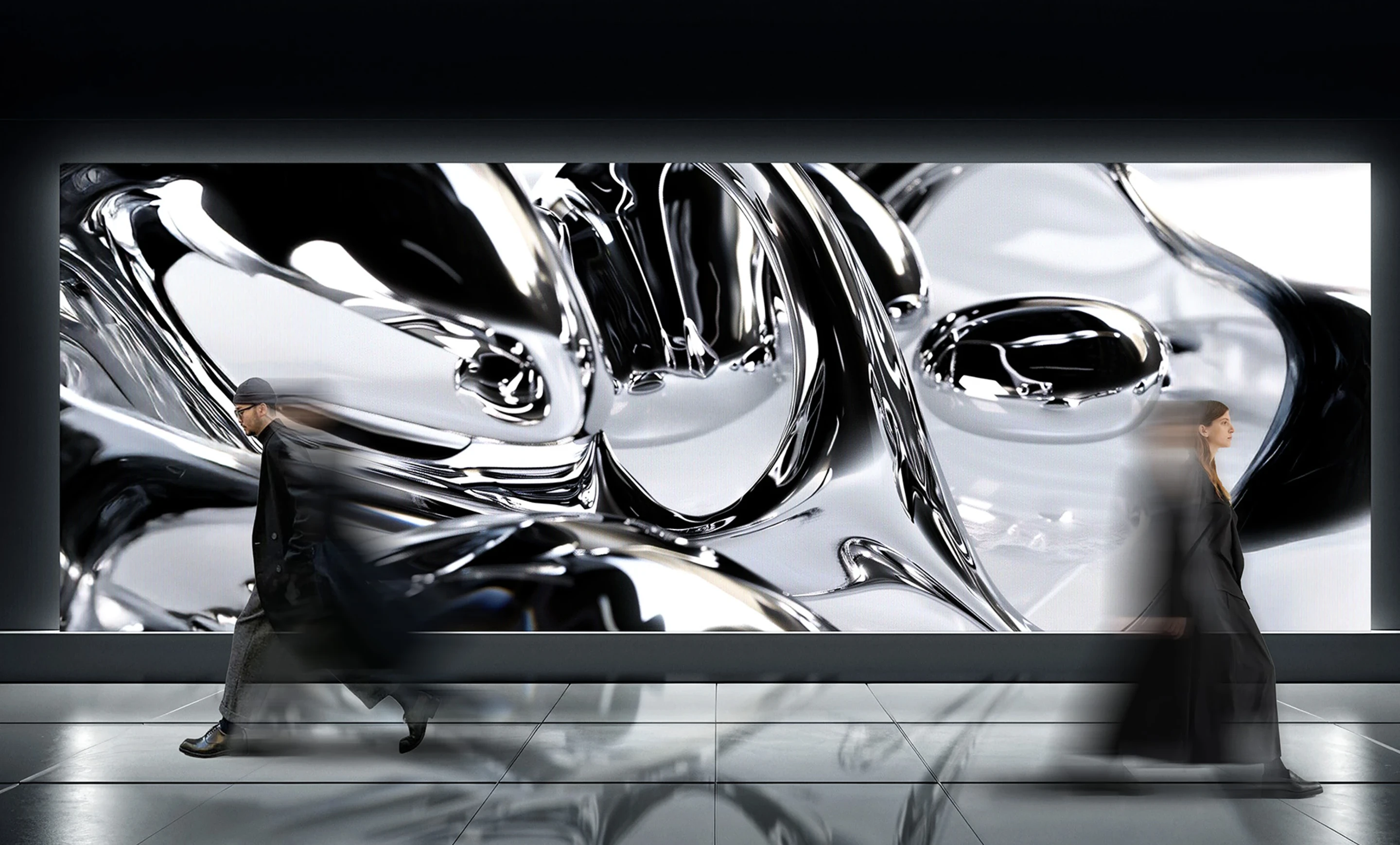
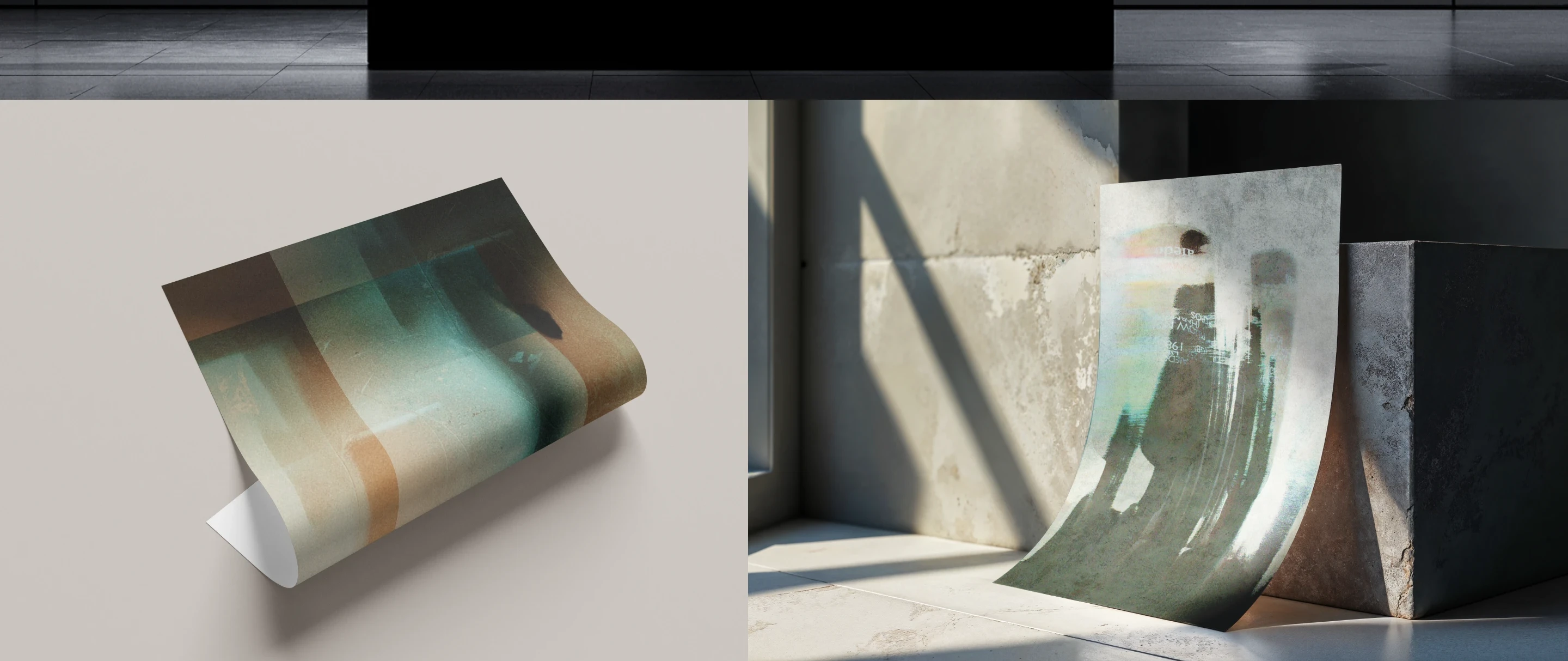
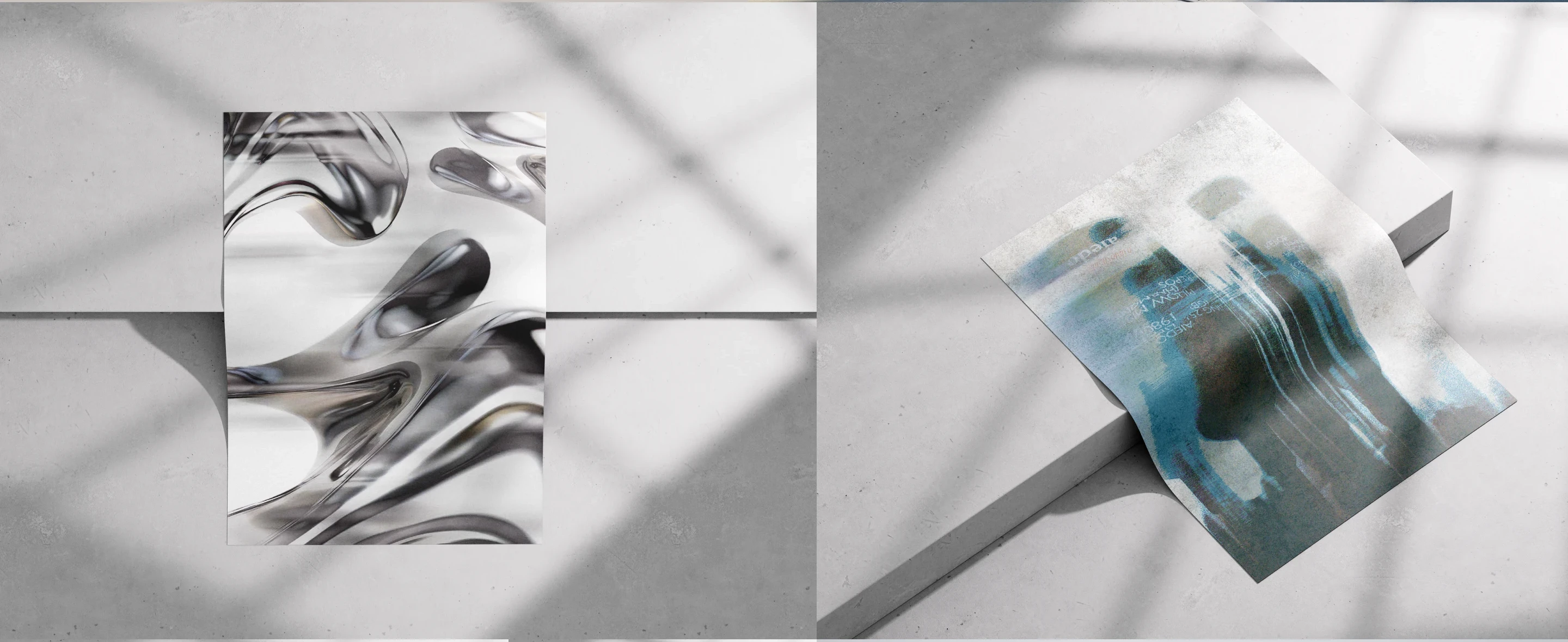
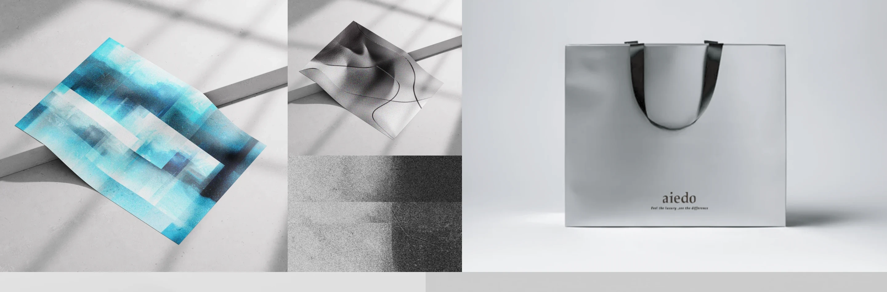
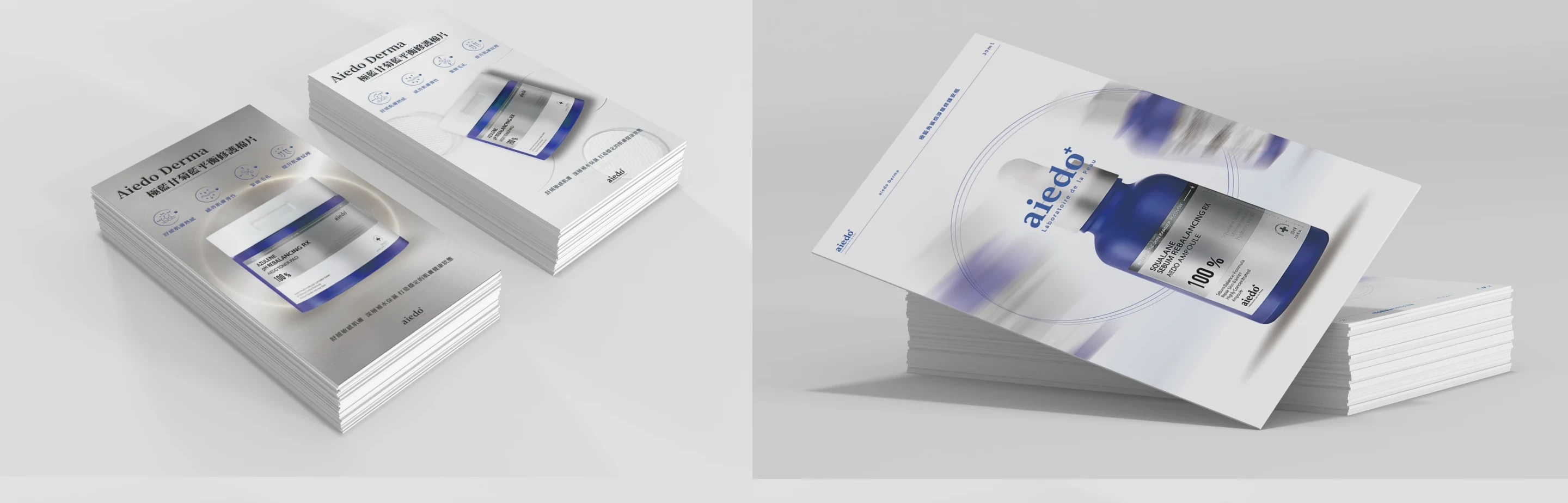
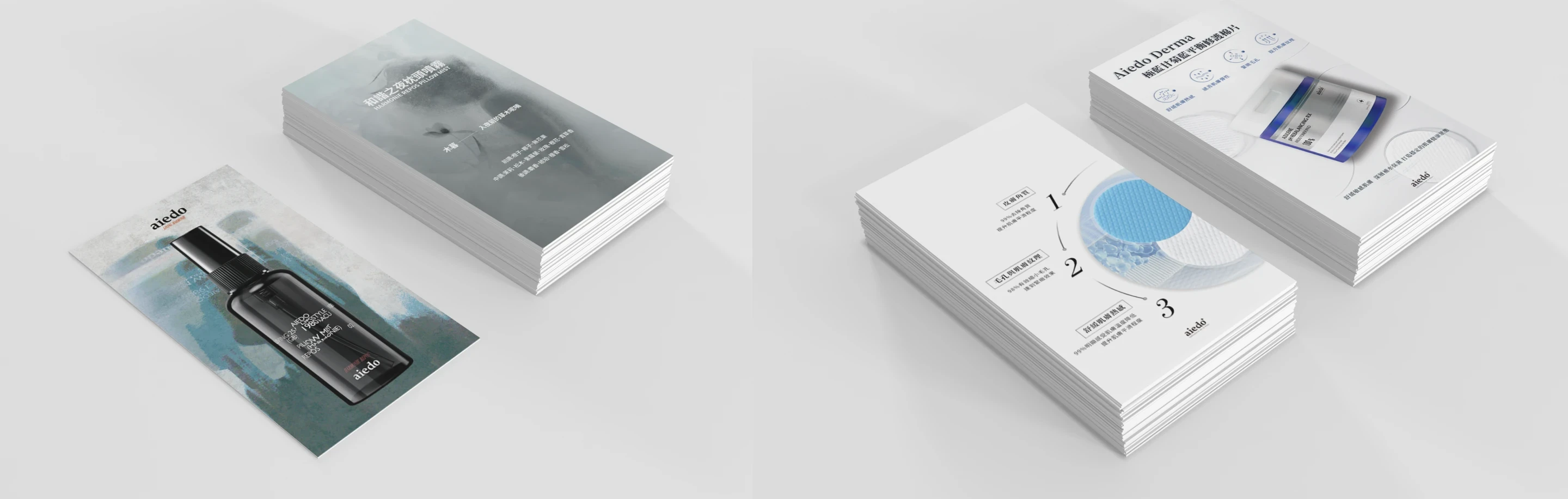
Five years of poster and print experiments.
A running body of self-initiated poster and print work — a place to push type, texture and image further than client work usually allows.
Across five years the posters became a sketchbook for visual ideas — experimental typography, motion blur, layered type and abstract marks.
Each piece is a small test of how far an image can be pushed before it stops reading.
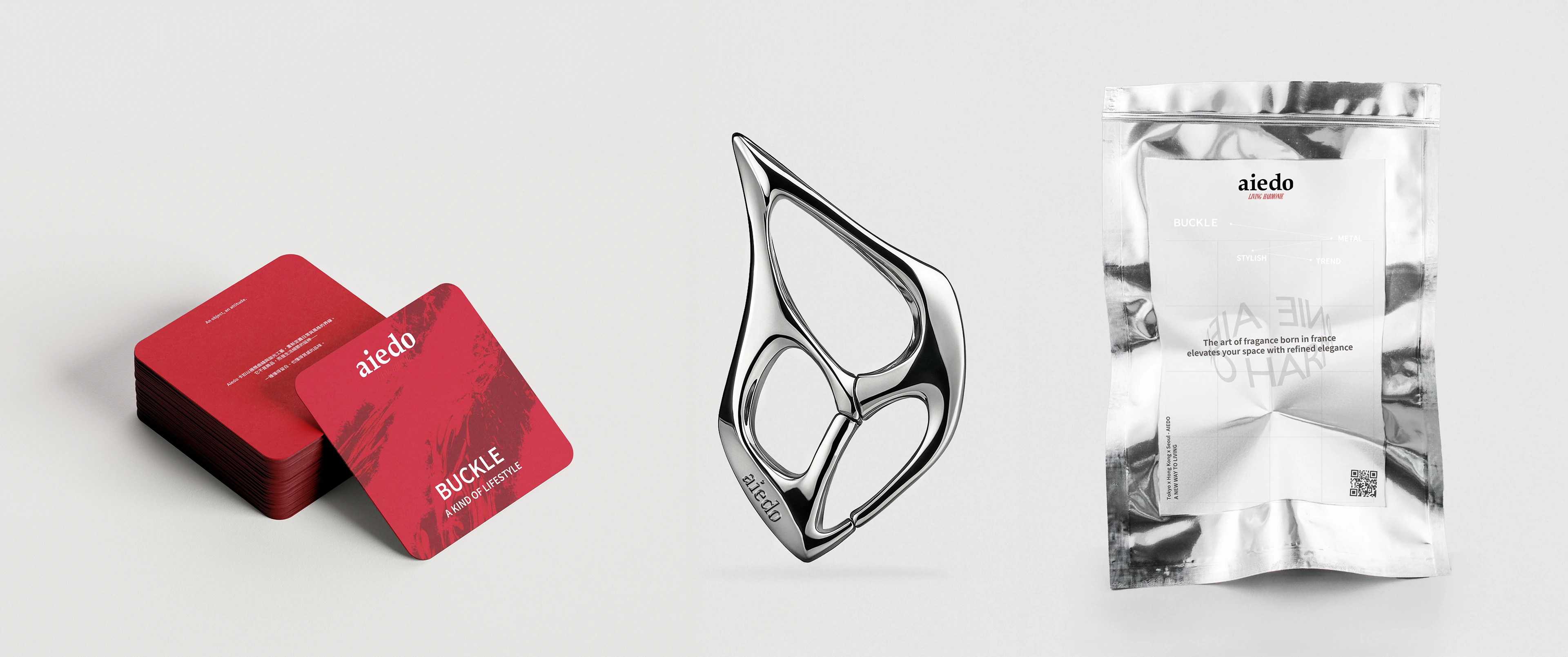
The throughline is texture and tension — type that blurs, dissolves or layers until it feels like motion frozen on paper.
The work leans on contrast: sharp letterforms against soft grain, calm grids against chaotic image.
The pieces run from personal posters to editorial covers and printed merch — including “In the blur of life”, the “Body / Mind” tutorial series, the “Issue” covers and a “Keep going” apparel print.
Why this is here: these had no client and no metric — that's the point. They're where I test how far type and image can go, and the muscle built here shows up later in client work.


Want the complete collection, in full resolution?
See the full collection on Behance ↗︎